Sitting on my last flight I realised that common pain points of flying reflect web user experience design fails. Looking at this process through user experience glasses provides insights into how both the flying and web experience could be improved.
Buckle up as the cabin crew cross-check doors and take off into learning more about user experience (UX)!
Boarding
The boarding process of a plane is one of the most infuriating and tedious processes of flying. Queue jumpers, aisle blockers and those people whose carry on luggage the size of a baby elephant. If there wasn’t a huge benefit at the end, like a beach vacation, city to explore, or friends to visit no human being would voluntarily go through this process.
UX Lesson #1
There is a correlation between how much a user will go through versus the benefit to them in the end.
Your website isn’t giving them a Cancun vacation, Paris or their BFF. Things like long load times, broken links, and annoying interruptions are all screaming children in the seat next to your user (and they will get up and leave).
The role of a user-experience designer is to plan out the journeys your passengers may travel through. Showing them the benefits of your product/service – and that buying, subscribing or contacting you is worth their time. All while making the process as easy as possible.
UX Lesson #2
Plane travel is unique in that there are no viable alternatives – buses or boating are not usually suitable options for international long-haul travel. On the contrary, your website users have almost infinite other options available to them in a new tab: another product, article to read, or company to contact.
If users have an easier alternative, they’ll probably take it. Or, simply not bother at all.
Time for Take-off
UX Lesson #3
Now you’ve found your seat – my first priority as a plane user is usually a beverage (then I want to watch a movie and hopefully catch a bit of a snooze). But you can’t! Put your phones away, it’s time for the in-flight safety demonstration.
Don’t force your user into something they don’t want (or need), give the user options and a way to keep moving that don’t involve exiting your site.
How many times have you watched that in-flight safety demonstration? Every, single, time! An optimal user experience would allow your passenger to opt-out if they know the drill. How refreshing would that be?
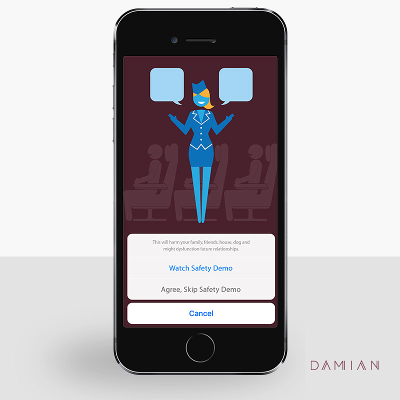 UX Lesson #4
Did anyone really not know how to buckle a seat belt? Probably not. While you should consider new users, there are some learned behaviours. UX design is about thinking and designing around the user. Consider new users, but don’t frustrate recurring visitors.
The other issue here is: the law. It’s reason flight attendants have to run the safety demonstration. They have no choice.
UX Lesson #5
On top of legal requirements for your website, there are ‘laws of the web’ your site must comply with. From issues regarding accessibility, spam, confidentiality, and best practices – UX takes these into consideration in planning your site. Sometimes, annoyances are a requirement (like safety videos and website pop-ups) but they should be controlled, planned and well thought out – or they’ll likely be ignored.
The Flight
UX Lesson #6
You’re in the air, finally! After take-off the flight attendants’ priority seems to be handing out paperwork. Those annoying immigration forms on you international flight.
Overloading a user with unnecessary or untimely information will mean it ends up lost, incomplete, crumpled or forgotten. At the start of a flight, there are six more hours before an immigration form is relevant. It doesn’t make sense for this to be presented yet.
UX design informs the flow of information in your site. Your website shouldn’t be driven based on what you, as a business, want your users to know. The perfect time for the immigration forms would be after the final meal service is complete and tray tables are cleared. Hand them out timing it so passengers have a comfortable amount of time to complete them. You’ll offer a much smoother experience and, from what results have shown, will obtain better responses!
UX Lesson #7
A complimentary pen when needed would be a nice touch. I’ve never had an airline offer, but such a simple gesture would have a powerful impact. I’m a prepared and experienced traveller, but I am always scrambling asking fellow passengers to borrow theirs.
Great UX design will delight users – making your website easy to use and remain memorable.
Thanks for flying with us today, it’s time to enjoy your destination. I hope that helped in understanding some UX theories and concepts. Have a great day, wherever your final destination may be!
Enjoy this article? Read my Allegiant Airlines branding and customer experience article.