A recent Microsoft study found that since the year 2000 (or about when the mobile revolution began), the average attention span dropped from twelve seconds to eight seconds. In an era where attention spans are dwindling, the average web user expects to quickly and easily find the information they want, when they want it. Intuitive website navigation is imperative to ensure visitors don’t bounce from your site.
Most people think of the header menu when they think of website “navigation.” However, we see web navigation more holistically, encompassing every aspect of the user’s journey to finding information on your website. A well-planned site navigation can lead to an improved buyer’s journey, increased conversions, and an overall better user experience. In this article, we’ll review website navigation best practices to keep your web visitors happy, so that they come back for more.
Home is where the journey begins
The the main purpose of a homepage is to get people to the information they want as quickly and as easily as possible. In respect to navigation, the homepage is the gateway for many of your website visitors and serves to guide them along their customer journey.
For most of your visitors home is where their user journey begins, and users will often click home to reset or redirect their journey. A user’s expectation when visiting the homepage is to dive deeper, so it’s important to clearly display information on your homepage that directs them down the path to purchase.
Organize the main navigation menu
One of the most important features of website navigation is the header menu. This is a high-level list of important pages on your website, usually listed horizontally as links at the top of every page. The menu navigation exists to help users find content, so it should be simple, intuitive, and should guide a visitor to the content that will help them find what they need. Much like the homepage, users will refer to the menu when trying to reset or redirect their journey.
Tips for an intuitive main navigation:
- Be clear, not clever
We appreciate clever copywriting, but not when labeling menu items. Be descriptive and clear when naming menu links. As an example, people expect to see “Contact Us” not “Reach Out”. - Place the most important links first and last
The first and last links are the most memorable, so use those links to direct buyers to key pages. - Limit the number of menu items
Hick’s Law states that providing more options will only lengthen the time it takes for a prospect to make a decision. Keep the menu light with five to seven items max.
Consider the mobile experience
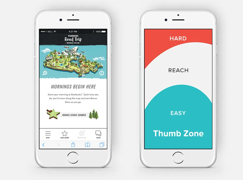
A common trend in mobile web design is the hamburger menu, named after its appearance, consisting of three parallel lines in the top right corner of a browser window. The hamburger menu was rapidly adopted in the past five years, as mobile web browsing increased. The hamburger hides the menu on small screens, like tablets and smartphones, and only expands to display the menu when it’s clicked or tapped.

Hamburger menus are still controversial for UX and design professionals. UX experts know that hamburger menus confuse users and reduce conversions. New approaches to mobile menus are becoming more common, with menu items closer to the bottom of the screen in the “Thumb Zone” (as seen on the Facebook app, and other apps).
As the battle of whether to hamburger or not to hamburger rages on, remember that every audience is different. If you’re targeting millennials, they shouldn’t have a problem navigating a hamburger menu. If you’re targeting baby boomers, that might be a different story. The only way to truly know is to test and optimize based on your results.
Here’s a fun and interesting article discussing the results on an A/B test comparing the performance of a hamburger menu and menu button.
Use the footer for enhanced navigation
As disappointing as this may be, users spend very little time actually reading the copy on your homepage. They are typically looking for a particular piece of information, and we’ve learned that many people use the footer to quickly find what they’re looking for. Let’s review two popular footer formats.
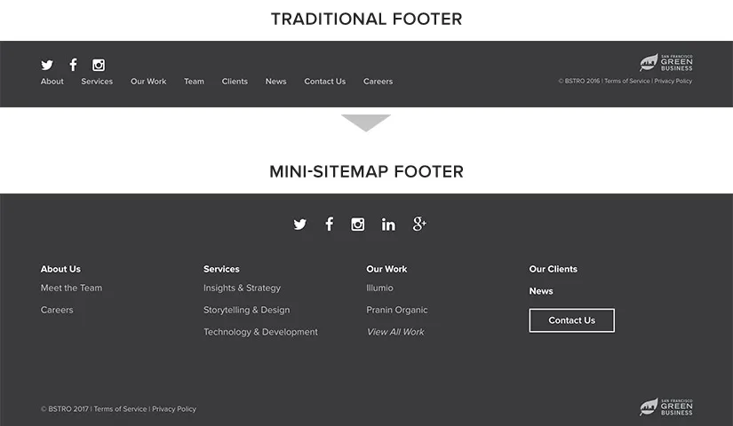
The traditional footer is a good option for simple websites. This version of a footer highlights the most important, top-level menu links along with copyright, social links, and privacy information.
A newer trend is the mini sitemap, an improvement to the traditional style. This is especially popular among larger companies with more complex websites. A mini sitemap organizes links in categories which gives users the ability to see the entire navigation at a glance. Since cramming too many links in your header can be overwhelming and messy, a mini sitemap allows you to list the most important links in the header menu and everything else in the footer.
Optimize using website navigation best practices
Now that you know some of the website navigation best practices, you can improve your user experience and increase conversions with a few simple tweaks to your navigation.
Use a Google Analytics to understand your visitor behavior flow
Within your Google Analytics dashboard, there is a behavior flow chart to explain where your visitors go on your website — and how they get there. Here’s a great article explaining how to use this tool. Use these insights to make adjustments to your navigation and continue to learn and optimize over time.
Use a heatmap tool for advanced insights
Heatmaps are visual displays of user behavior, overlaying your website pages. Use a tool like Hotjar to understand exactly where and how users interact with your webpages. With Hotjar, you just add a piece of code to your website, and after time, you will have detailed insight into user behavior on each webpage. We recommend having the code on your site for at least 30 days to get an accurate depiction of user behaviors.
Optimize based on data
Based on your learnings from Google Analytics and heatmaps, make a few changes to your navigation and test them. If you don’t want to send all of your traffic to your new navigation, try an A/B test and only send a portion of the traffic at first. As you become more informed, you can release your optimized navigation to every visitor. Here are some tests to try:
- Remove any links that don’t get clicks.
- Try moving the poor performing links to see if they perform better elsewhere.
- Try renaming items with low click rates.
- Organize navigation to minimize the number of clicks to get to high-value pages.
Now that you have the tools you need to optimize your website navigation using best practices, continue to test and learn from your results.
If you need some help, enlist an expert (like myself 😉).