Happy New Year! I compiled a couple of interesting data visualisations from 2014 I found to kick off the new year.
The map above is a visualisation of tracked Runkeeper activities from 2014 from 1.5 million users. The combination of colours and interesting data – beautiful.
Explore the Full Map
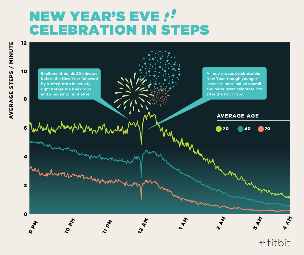
Another interesting visualisation comes from Fitbit. It plots the average step count for different age groups over the New Years’ celebrations.
Bring on 2015 – and don’t forget to #trackeverything (then analyse it and make meaningful and beautiful things).