Client Name
Waves Coffee
Industry
Food, Retail
Role
Art Director / Web UI Designer
Waves Coffee
Food, Retail
Art Director / Web UI Designer
Waves Coffee is a family-owned franchise with over 20 locations throughout Greater Vancouver, British Columbia, and upcoming plans to expand into Alberta.
While in the process of updating their brand, Waves Coffee partnered with Forge and Smith to reinvent their website to their new design and service direction. They knew that a new website would bring their service offerings to life and cater to their growing digital marketing needs.
To complete this site, I worked closely with the UX designer, content strategist and development team in the role of UI/visual design lead.
During the discovery phase, I conducted a brand discovery session with the client to understand the brand, business, history and goals for the visual design of the site.
The Waves Coffee brand was at a crossroads, with their existing image of a family-friendly orientated coffee chain with a dated look; the client wanted to shift their target market to young professionals and attract the coffee culture crowd.
The key messages the client wanted to express through the design:
The client saw the website as a keystone in the progression of their brand, so it was important that it was executed well. Their current website and branding material did not speak this target market.
After the Brand Discovery session I put together two directions to show how the brand could progress.
Through our discussions I learned that the client was open to adding new colours to their brand palette, so introduced fresh, bright colours to compliment their existing and subdued brand colours of blue and white. New, older typography was another new addition to bring the brand voice to life.
The second concept was more conservative, continuing with the brands existing blue colour palette, whilst still being a modern progression of the brand with clean and modern typography.
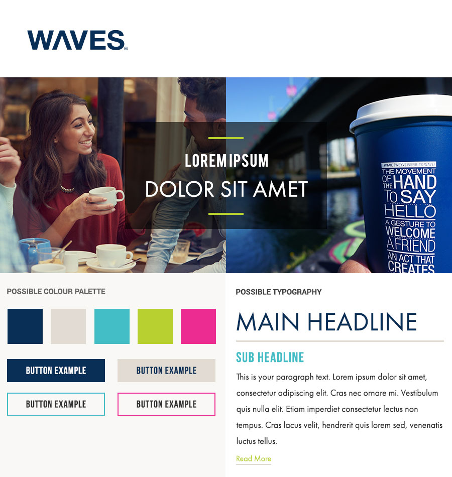
Colourful Progression
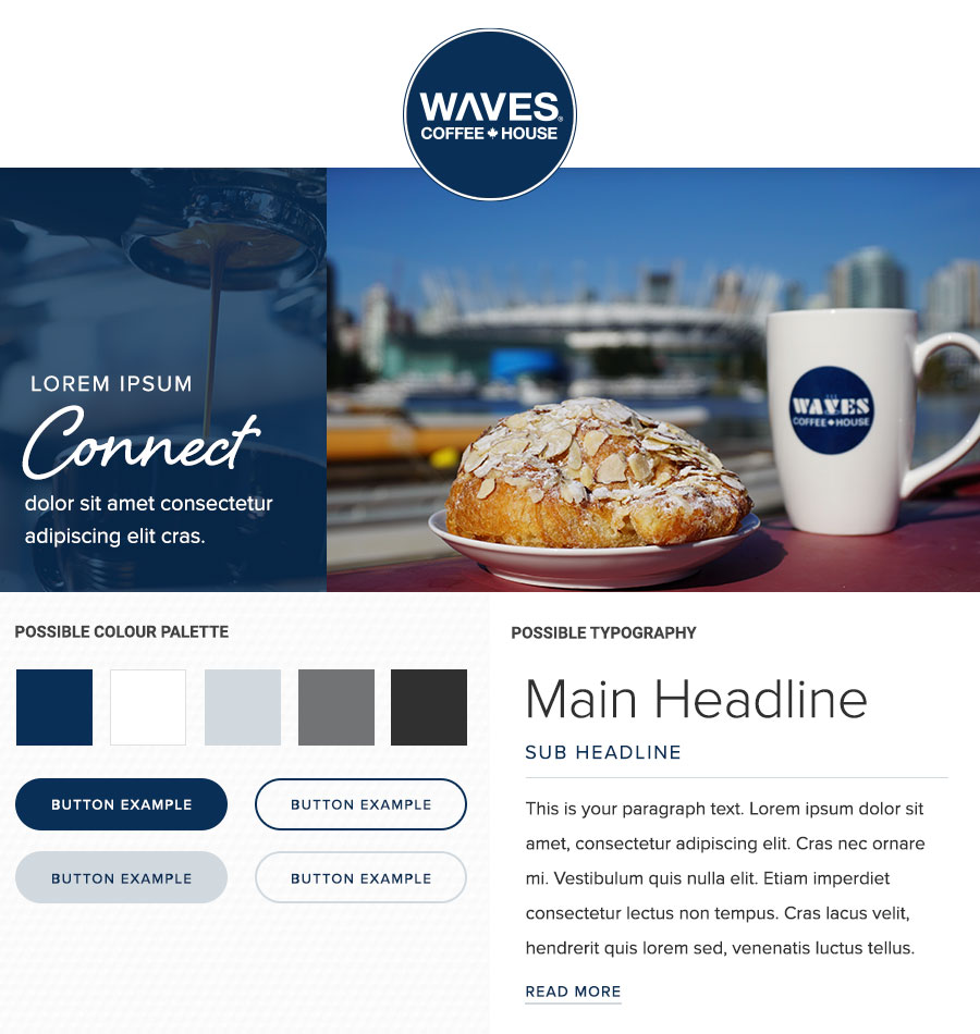
Minimal & Modern Evolution
Selected concept
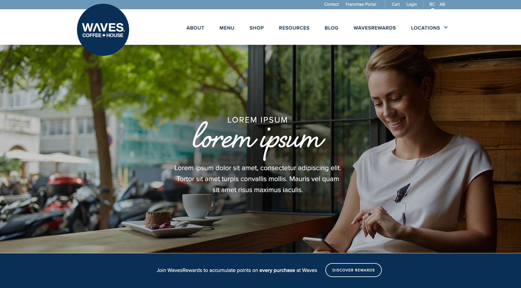
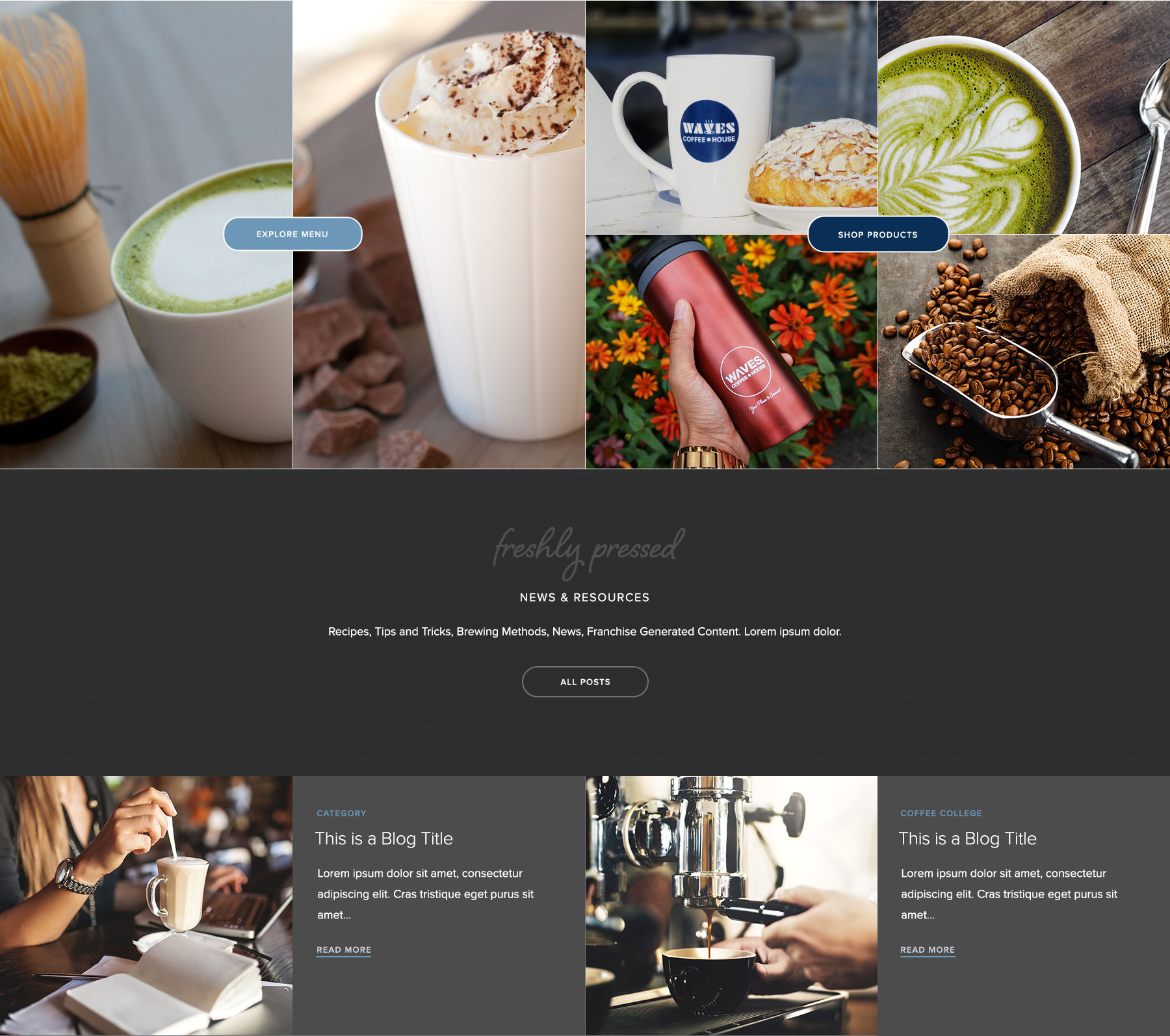
Once a concept was selected I was excited to start designing the entire homepage. The challenge was ensuring that the design felt warm and friendly despite the cooler tones of the chosen concept.
Explore the entire desktop homepage design below. The handwritten typography brought a friendly feel, with selection of photography bringing warmth to the design.
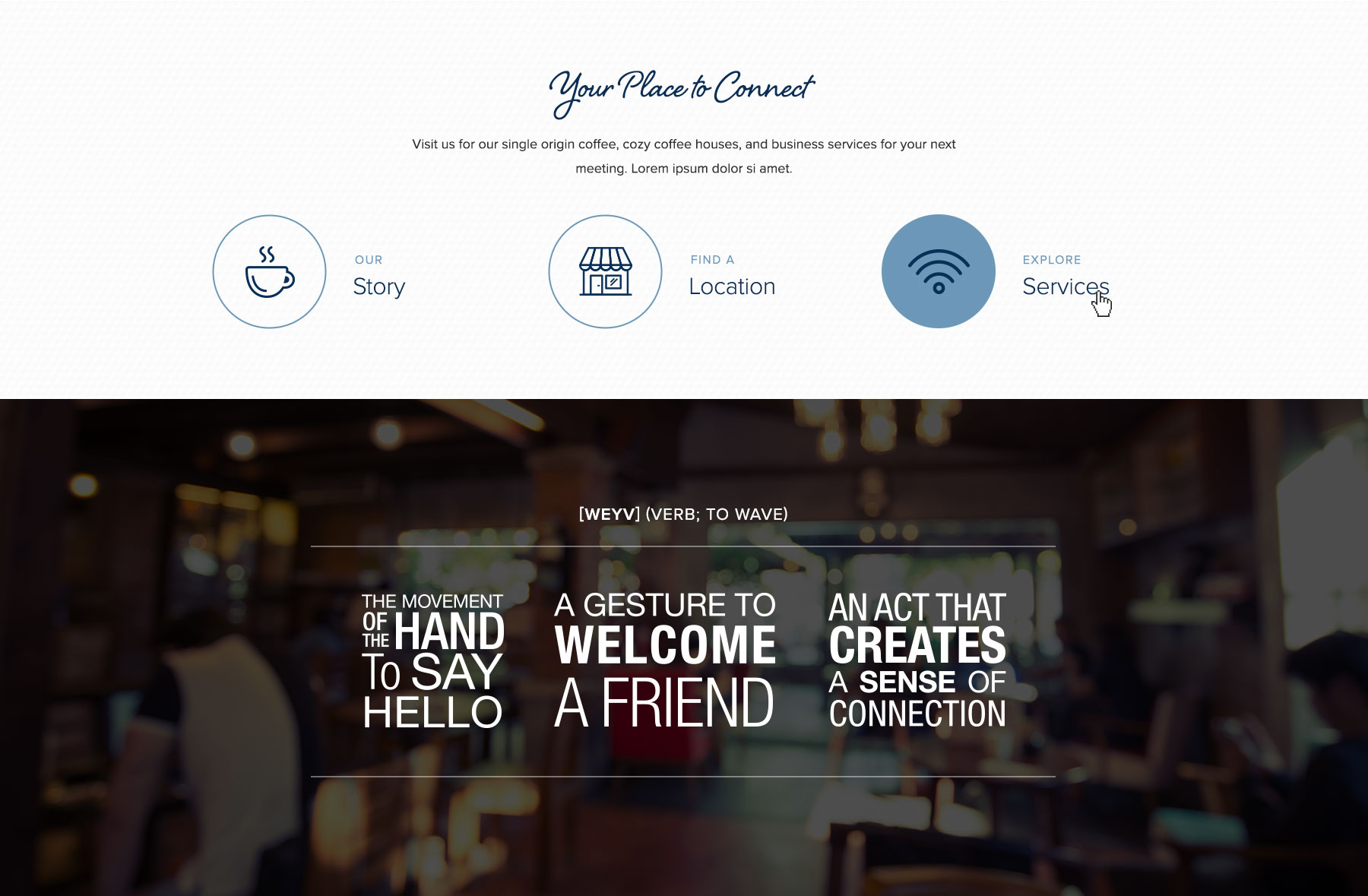
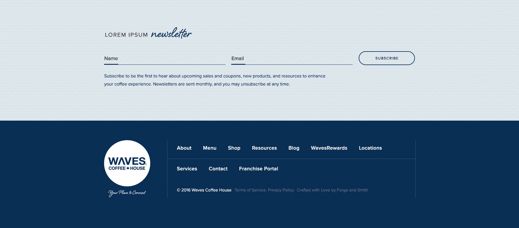
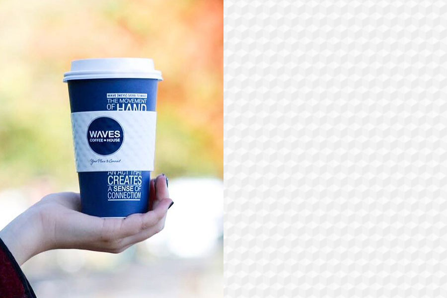
The textures used throughout the site were taken from the pattern of the Waves coffee cup sleeves.
Getting deeply involved and to know the brand and it’s product is an important part of my design process. When I visited several of the Waves Coffee location, this pattern jumped out at me as a way to tie the website to the physical store experience.
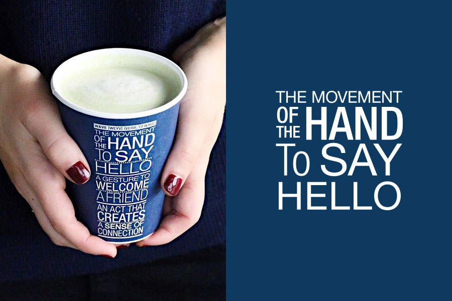
The client provided typographic word cloud artwork to be included in the site. The original design was stacked and tall to fit on a coffee cup.
I came up with a solution that would show the artwork, while be responsive and legible on all devices. The artwork was sliced in three, with some tweaks, and placed into columns.
It was a simple solution to a unique problem. The client was extremely pleased and requested to include this component across various pages.
I love designing down to the finest detail and going deep with a project. Being a coffee lover it was fun to combine my passions of web design and coffee.
Explore some of the key page designs below.
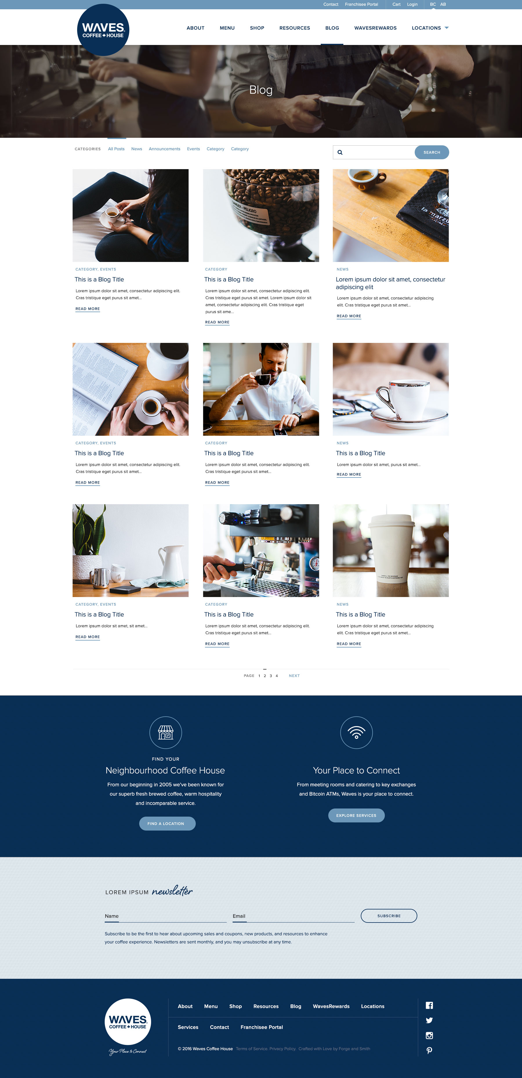
In order to meet project deadlines, the Waves Coffee blog design was kept simple; however, this was the perfect opportunity to let their high-quality photography shine with large imagery in each post.
Category navigation and pagination was kept simple, easy to use, and minimal.
I always take accessibility into consideration when designing, so I ensured that the labels would always be visible and that colour contrast made elements easy to distinguish. This was the only special case for this form styling, as this form only contained two fields – and it gave the client the clean, modern and minimal look they wanted. Forms used in other parts of the site, such as contact page and e-commerce, were treated in a more accessible-friendly way.
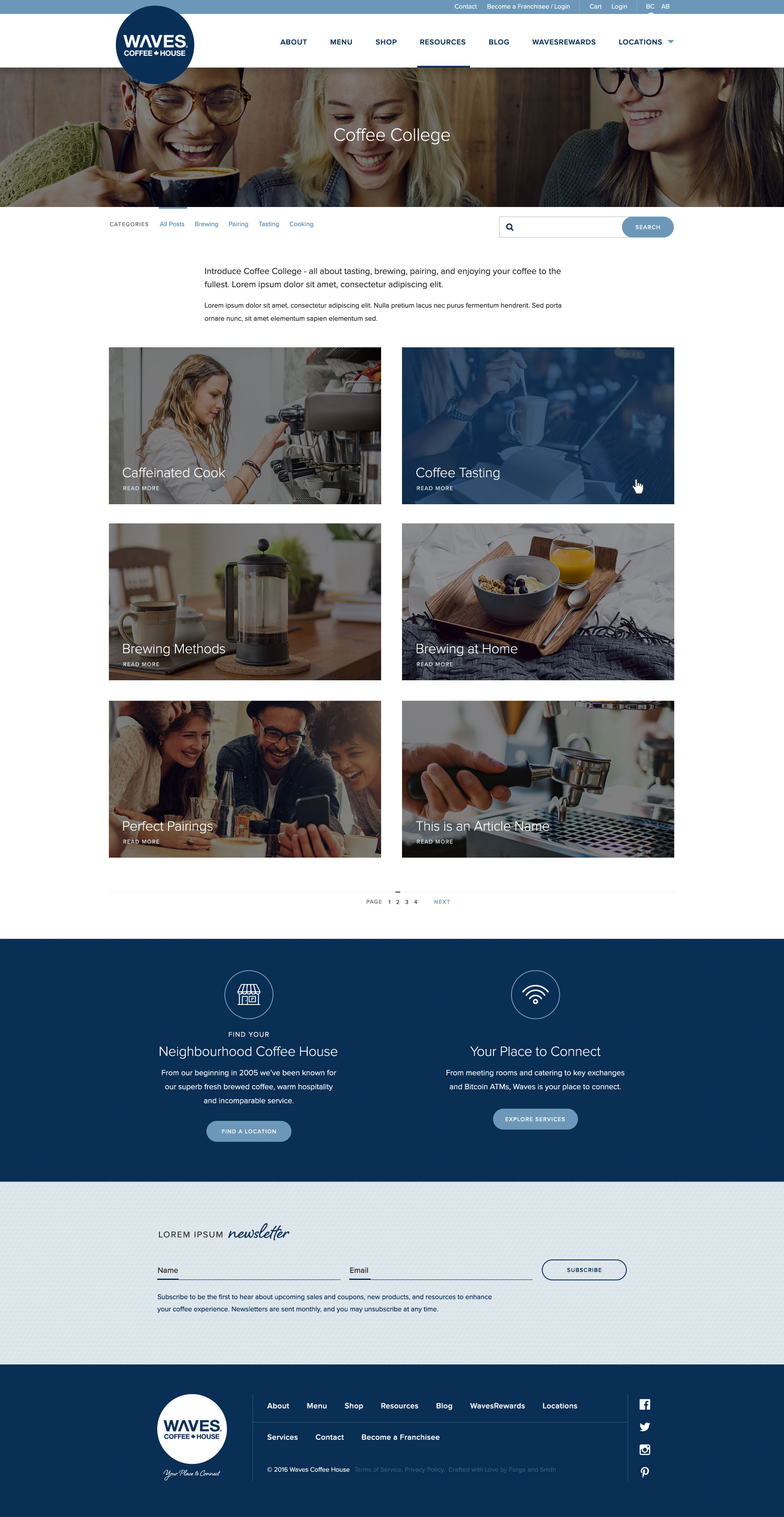
(aka. Coffee College)
The Resources section is a new section in the site aimed at attracting the hip coffee culture crowd and establish their credibility as experts and fine crafters of caffeinated beverages. This informed the decisions made in designing this page, and how it differed from the blog landing. Images are larger with a feature hover state. To ensure accessibility and clarity on touch devices, the ‘read more’ queue was also an important visual queue – and consistent with other design patterns on the site.
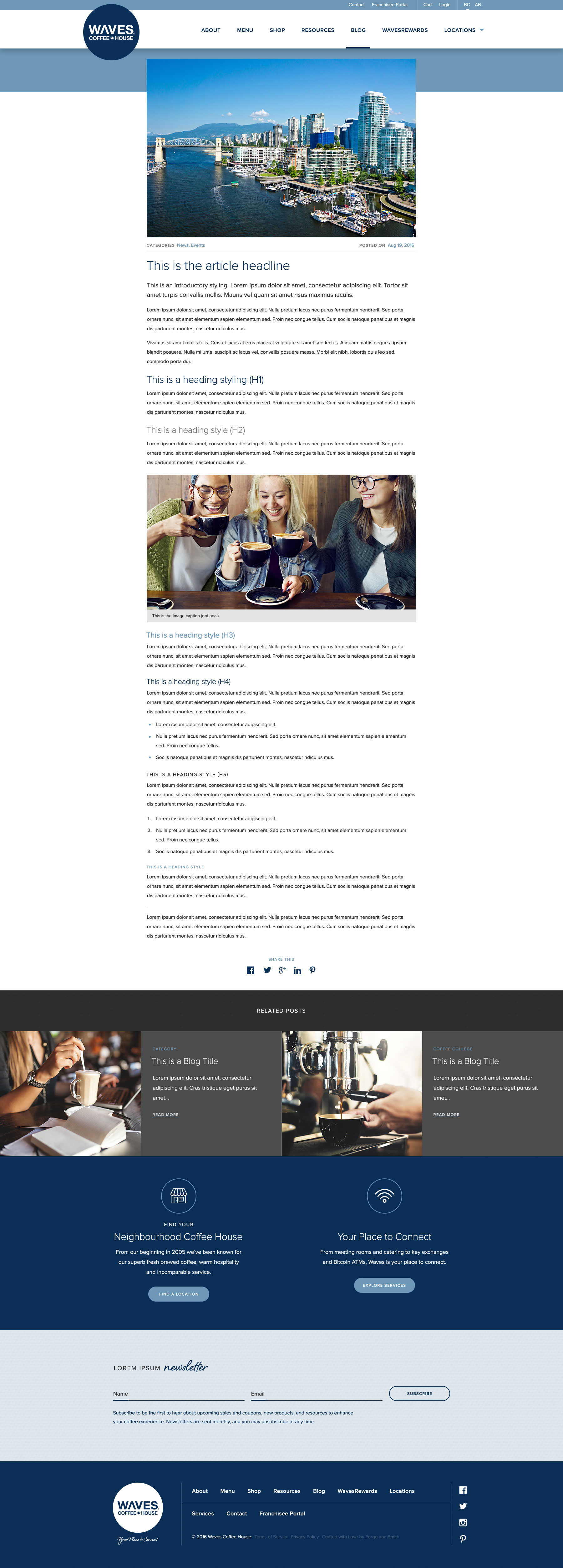
The Blog and Resources sections used the same article page template, as this was a lean project.
As well as a developer style guide handover, I like to include all of the available text formatting options on a page design. This gives both the developers and client an in-context reference for their formatting options – and becomes a valuable client reference.
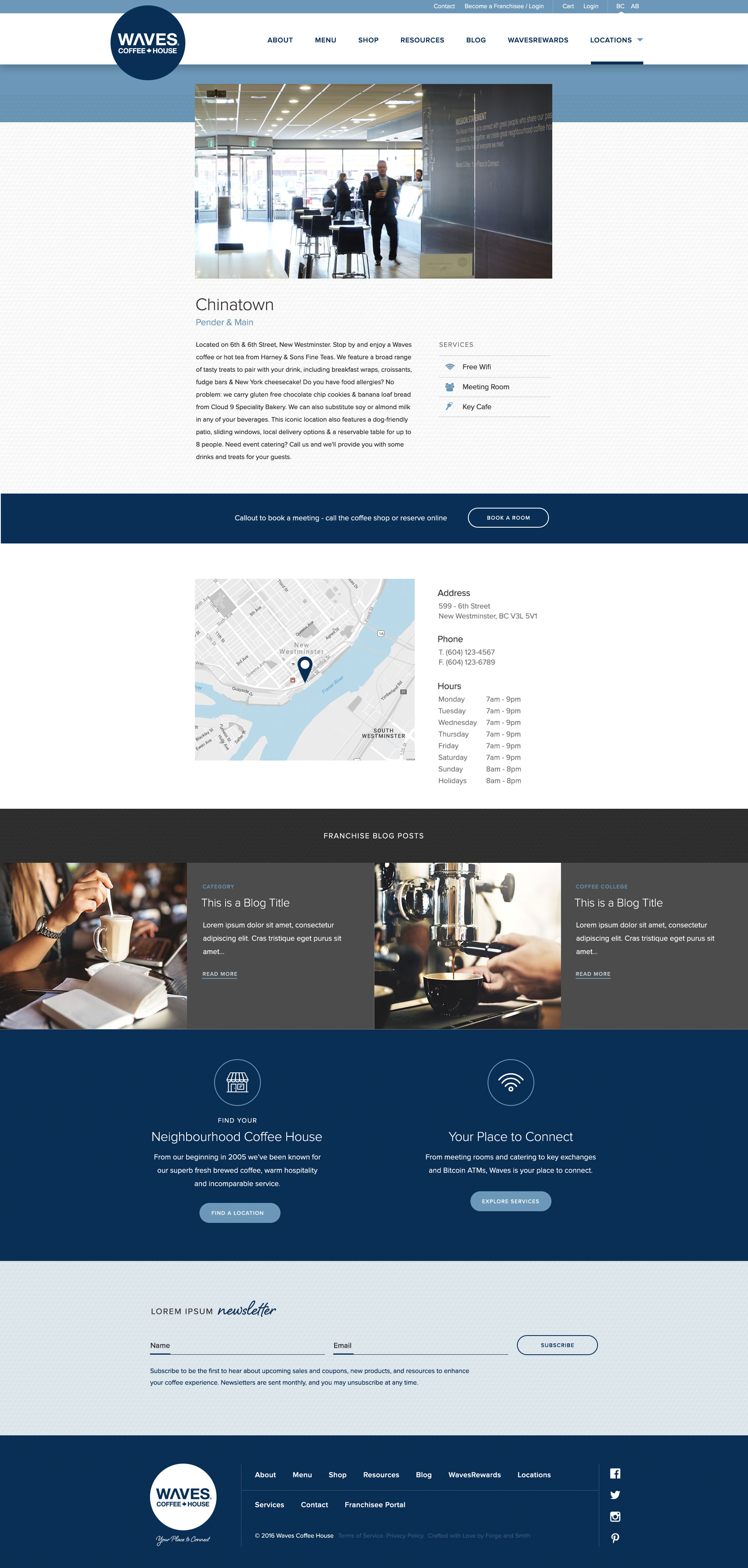
Each store has its own detail page for street address, contact details, hours of operation, services available and feature blog posts related to that location.
All of this information is arranged and displayed in a consistent format, that is easily scanned, and would caters to the various requirements of each store.
The Waves Rewards page was a portal to several areas and content for Rewards members. The page included a sub-menu, login form, promotional callouts and FAQ accordion elements.
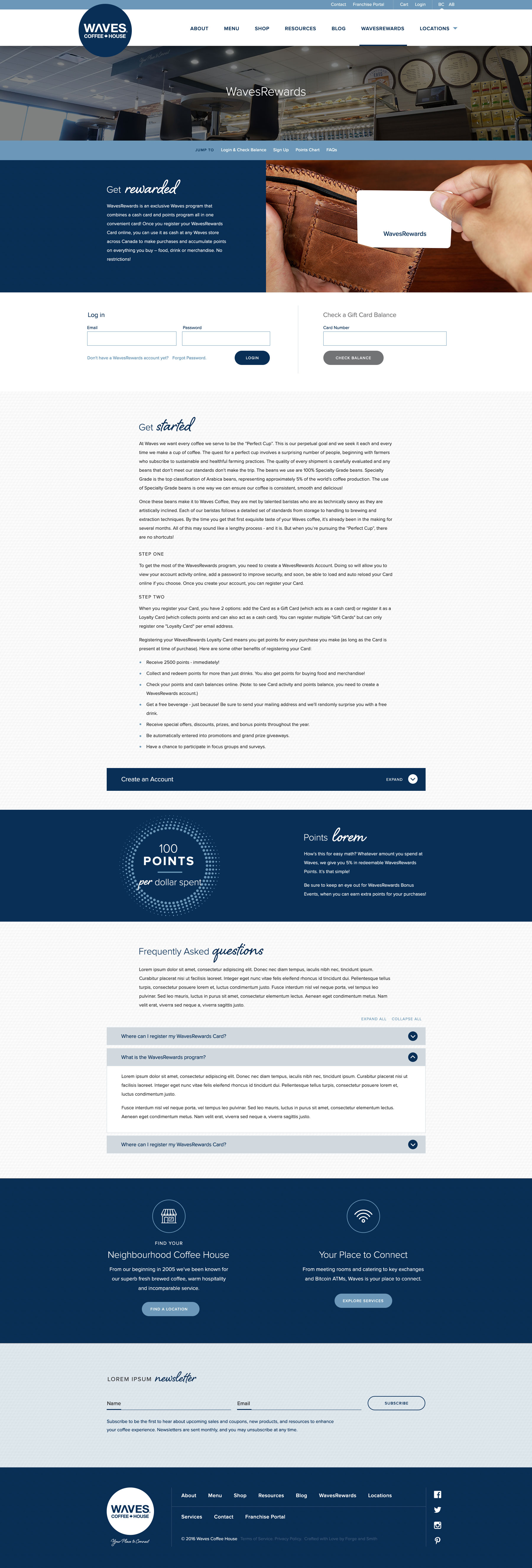
The completed site has fifteen unique page template designs, including three custom ecommerce templates.
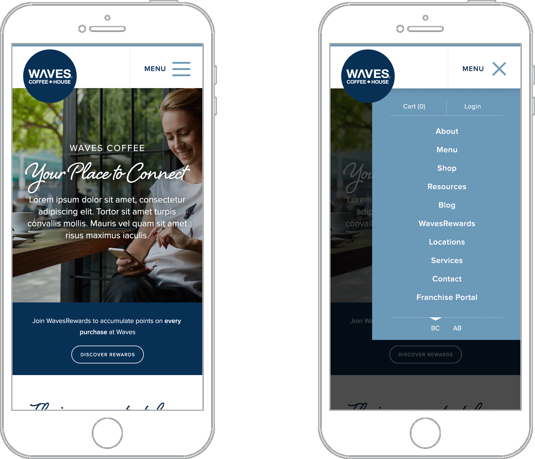
A mobile-first thought approach was taken throughout the design process. Design mock-ups of responsive mobile pages were created, along with a mobile-friendly navigation menu.
A much underestimated piece of the web design process is a thorough quality assurance check. An important part of my role in the agency, and as a designer, is ensuring that the finished product meets a high-quality standard of work – and will not break when the client inputs content.
With the design being created with mobile-first thinking and development restrictions in mind, I was always able to work with the development team to resolve any QA issues.
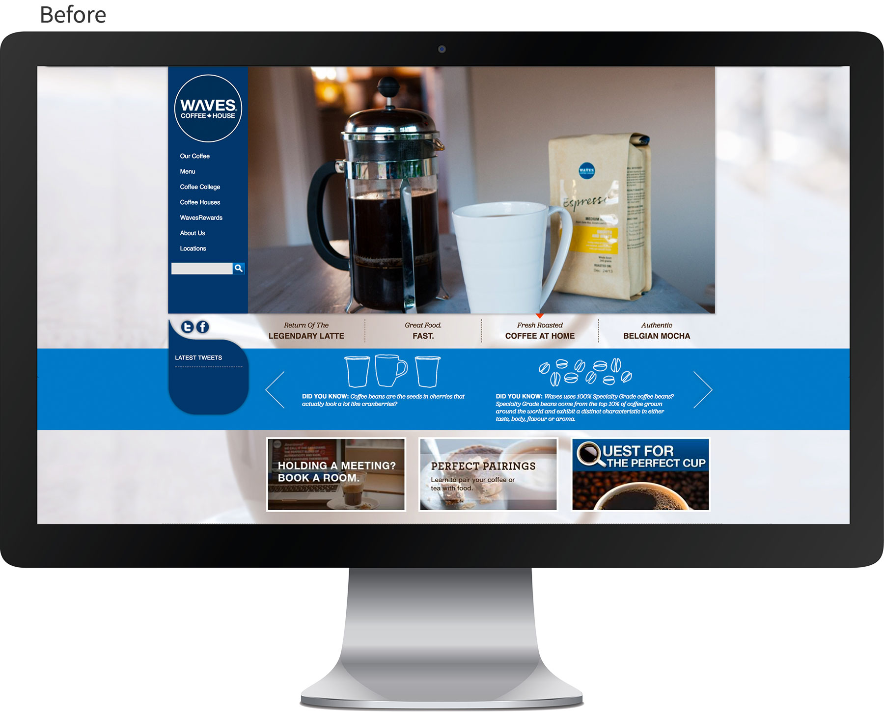
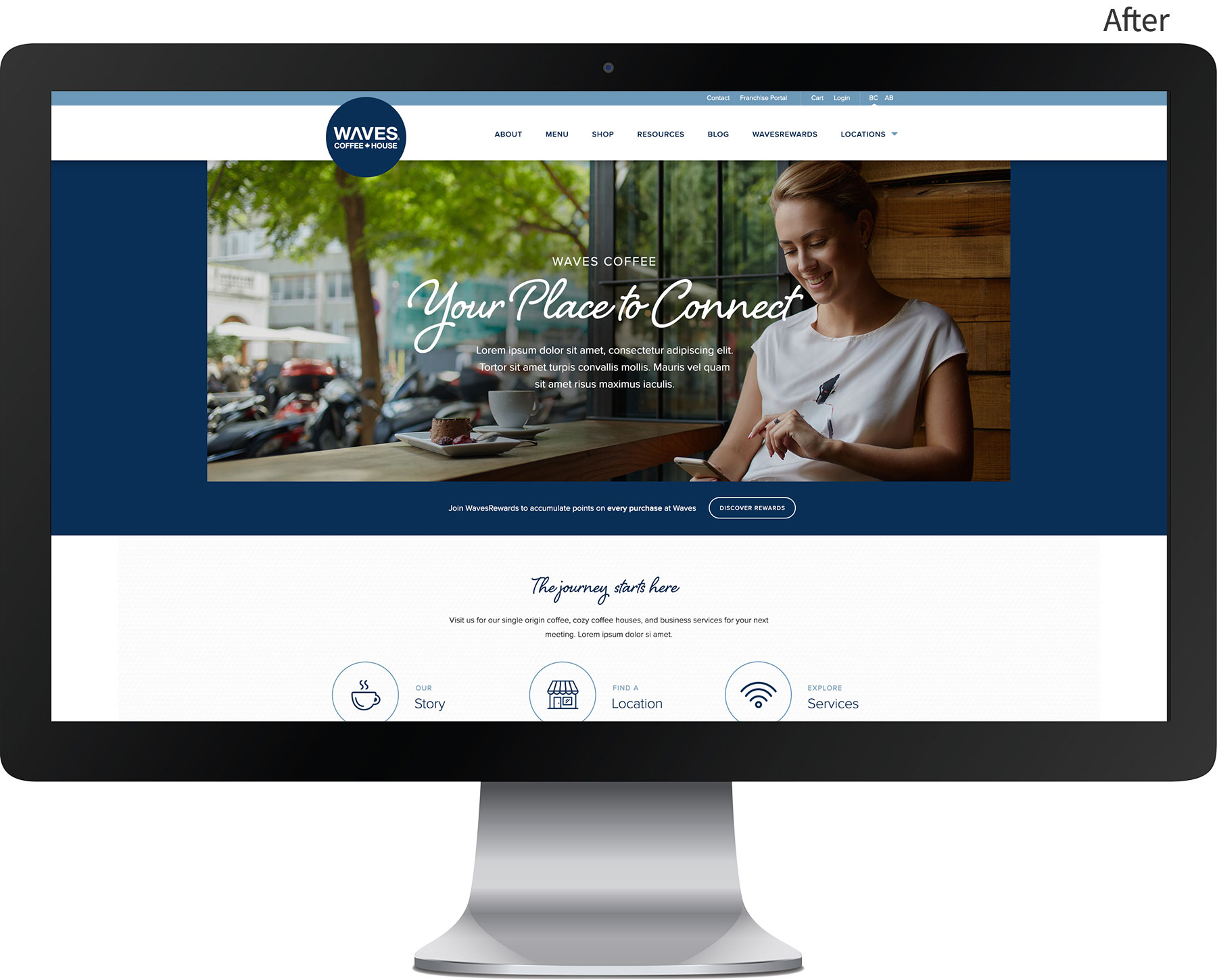
Unveiling the Waves Coffee website was a proud moment in my career. The established Vancouver coffee company now has a website to take them into the future, attract new markets and be a player in the competitive coffee market.
From clunky, dated and static to responsive, usable, modern and inviting. Review the transition by dragging the slider above.