Client Name
SweetGeorgia Yarns
Industry
Retail, Art & Craft
Role
Art Director / Web UI Designer
SweetGeorgia is a high-end yarn producer based in Vancouver. Known for their unique colours and premium quality product. Passionate about their craft – SweetGeorgia Yarns was looking for a website design to match.
“Passionate, relentless and unapologetic” is how SweetGerogia Yarns defines itself.
The brand arrived with a logo-mark, their signature punch of fuchsia and a load of potential. Looking for a vibrant, high-end, youthful design to reflect their product and resonate with their audience.
Given creative freedom it was exciting to launch into design concepts.

The Concepts
When working with creative clients it’s important to work in a collaborative way whenever possible – bringing creative energy together. SweetGeorgia Yarns was a delight to work with, I hit the concepts off with a style and mood board.
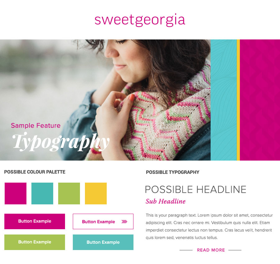
The following is a breakdown of the elements of the style tile presented to the client.
Colour Palette
SweetGeorgia wouldn’t be SweetGeorgia without fuchsia. We enhanced the existing colour palette with fresh blue, green and yellow. Youthful,vibrant, exciting and fresh range of colours.
Feature Typography
Through the style tile I brought out a feature typography element – a really beautiful treatment of the typography. This became a feature throughout the site – and a staple of the brand.
Typography
Body text was treated simply yet elegantly with an easy to read typeface and lots of white space. The typography struck up the right balance of simple yet elegant; understated with bold elements.
Texture
Being such a tactile product, I wanted to introduce some texture to the design. By incorporating subtle patterns over the bold colours.

The Outcome
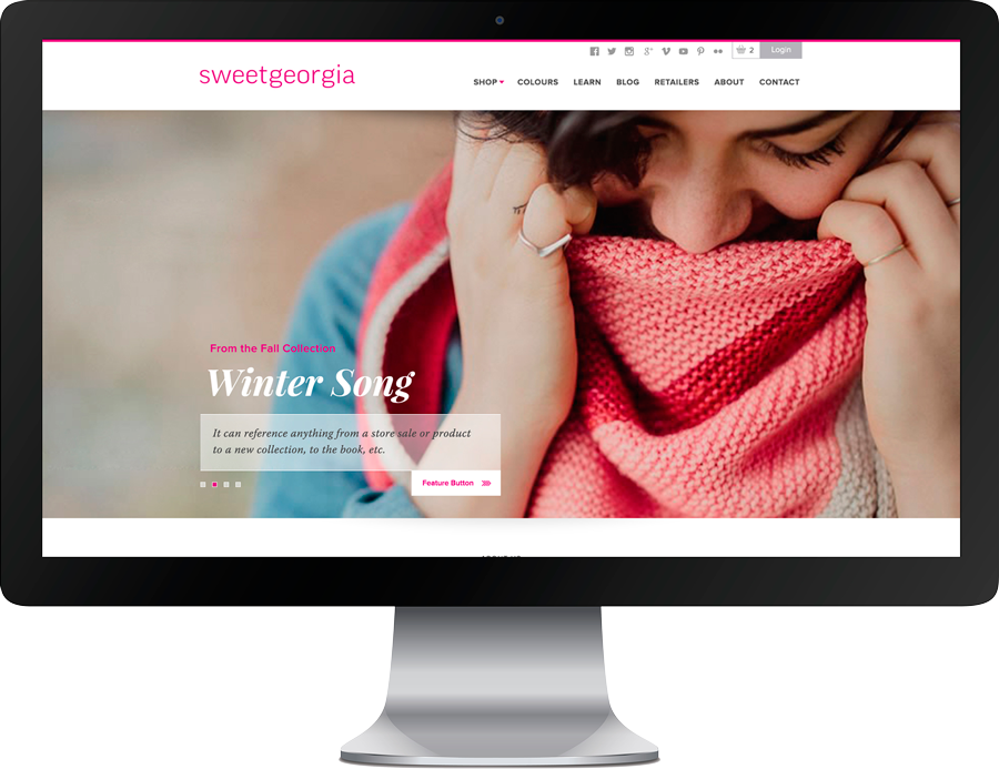
What started off as a brand with great product, a passionate team and a love of their craft was delivered a website that matched. The elements came together beautifully and site is a joy to their audience.
Homepage Design
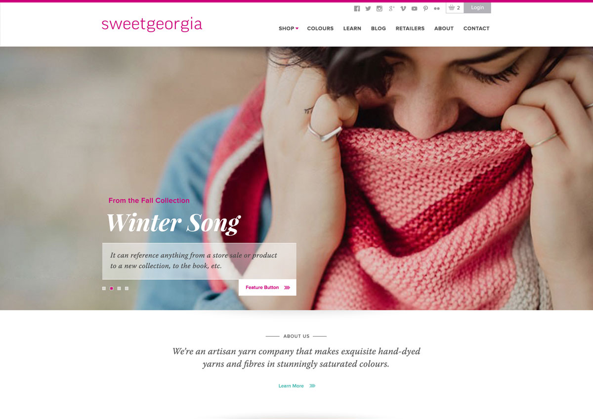
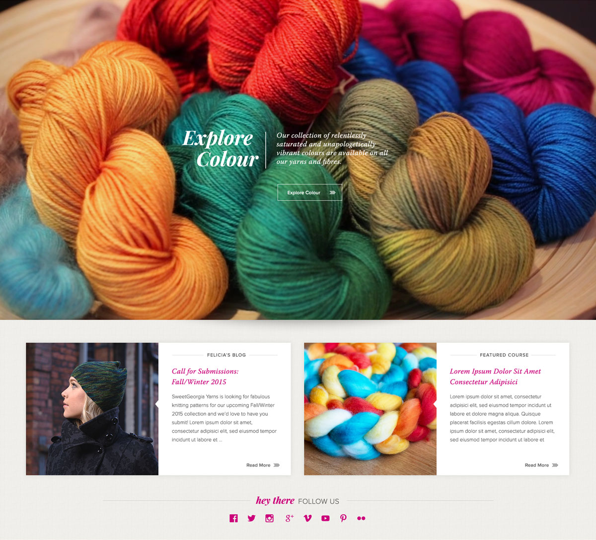
Take a walk through the complete homepage design. There was so much detail that went into the design, from subtle shadows to add a touch of depth, to a cute icon for a basket in the utility navigation.
I was excited to continue the feature typography throughout feature panels of the site, and section titles.


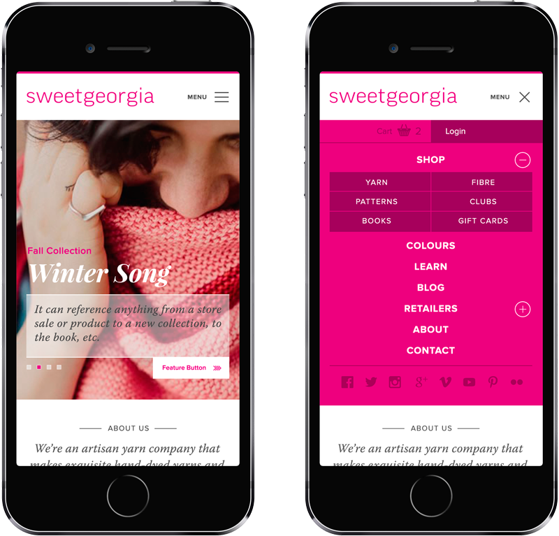
Mobile Design
The same amount of care and attention to detail was applied to the mobile design, including a custom mobile menu.
Crafted to Perfection
SweetGeorgia Yarns now has a complete site as vibrant and enticing as its products. Want the same transformation for your website?
