Client Name
Pacific Community Resources Society (PCRS)
Industry
Government, Non-Profit, Charity
Role
Art Director / UI Designer
Pacific Community Resources Society (PCRS)
Government, Non-Profit, Charity
Art Director / UI Designer
Pacific Community Resources Society is a not-for-profit association helping the community across the Lower Mainland of British Columbia, including the Vancouver, Burnaby, New Westminster and Surrey areas.
While their services and community work won them countless awards, their website was in need of an update – both structurally and in look and branding.
My role as designer for this project was to reimagine and update the brand and apply it to anew site architecture. Their logo, and use of blue colours in their palette was staying, but the client was open to change on everything else.
They needed a professional clean look, appealing to their wide age-range audience with a professional feel to appease their corporate and government affiliations. Accessibility was also a key issue for the client serving the community, so clean, legible text and clean easy to understand layouts were a requirement.
I presented this style tile as a possible look and feel for the new PCRS site. I explained that it would elevate the PCRS brand, whilst not being too corporate for their audience or alienating users familiar with their existing brand.
This was one of my early look and feel explorations and I was extremely pleased that the client chose this option.
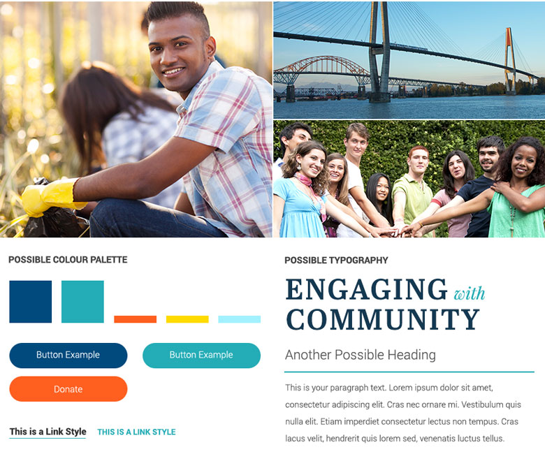
The colour palette incorporated their existing corporate blue colours – with highlights of bright colours that worked together. I purposely reduced the size of the three additional colour swatches to show that they would be used conservatively as highlights.
I wanted to create feature typography combination of italics and a slab serif typeface with an engaging and approachable feel.
The body paragraph and headings were treated clean and simply, set with a sans serif typeface for a clean and modern look.
There were no existing photography assets available. I paired the stock photography with Vancouver area shots to create a local link.
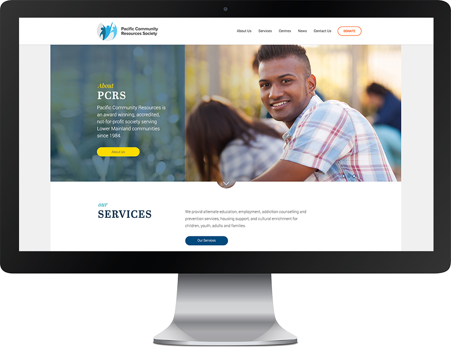
The new Pacific Community Resources Society website came together as a complete package that I am extremely proud of. I also designed business cards, stationery and brochures to complete their branding package.
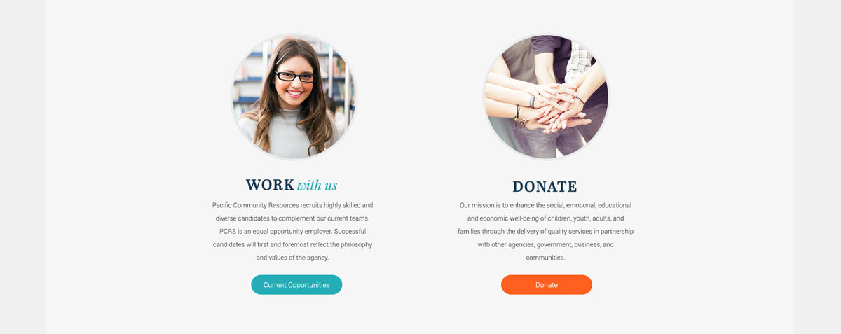
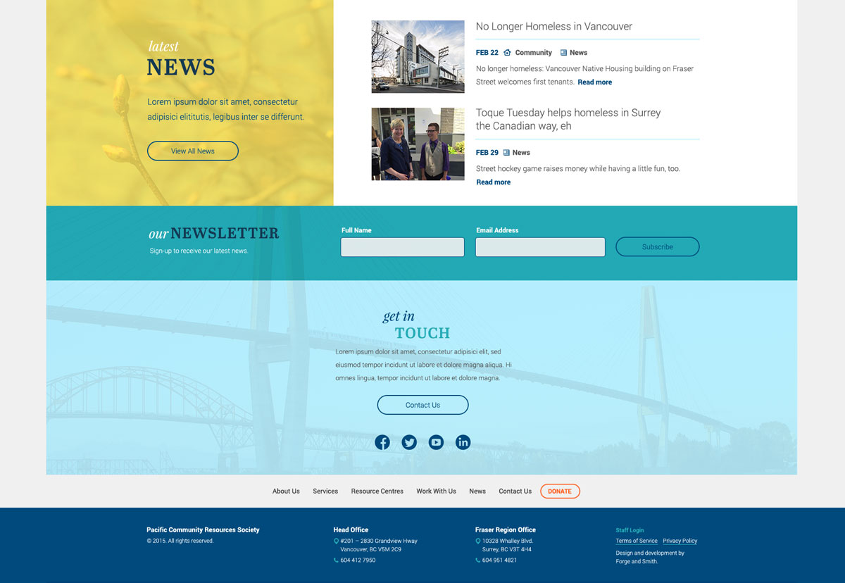
Below you can look at the full homepage design. This really was a labour of love, I am so happy with the final outcome. As well as the homepage, I designed a banner system for their interior pages that was on brand, unique and easy to follow.
The colours, typography and stock photography treatments came together in such a nice way for this not-for-profit client.
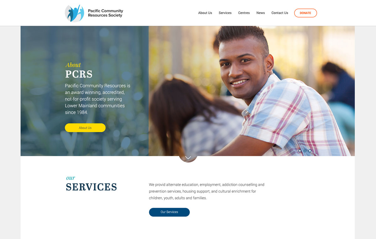
One of my favourite features of this design is how the banner area works on the interior pages. There is a strong hierarchy and system of how they work – with a consistent look.

PCRS now has an award-worthy website design to match their award-winning services.