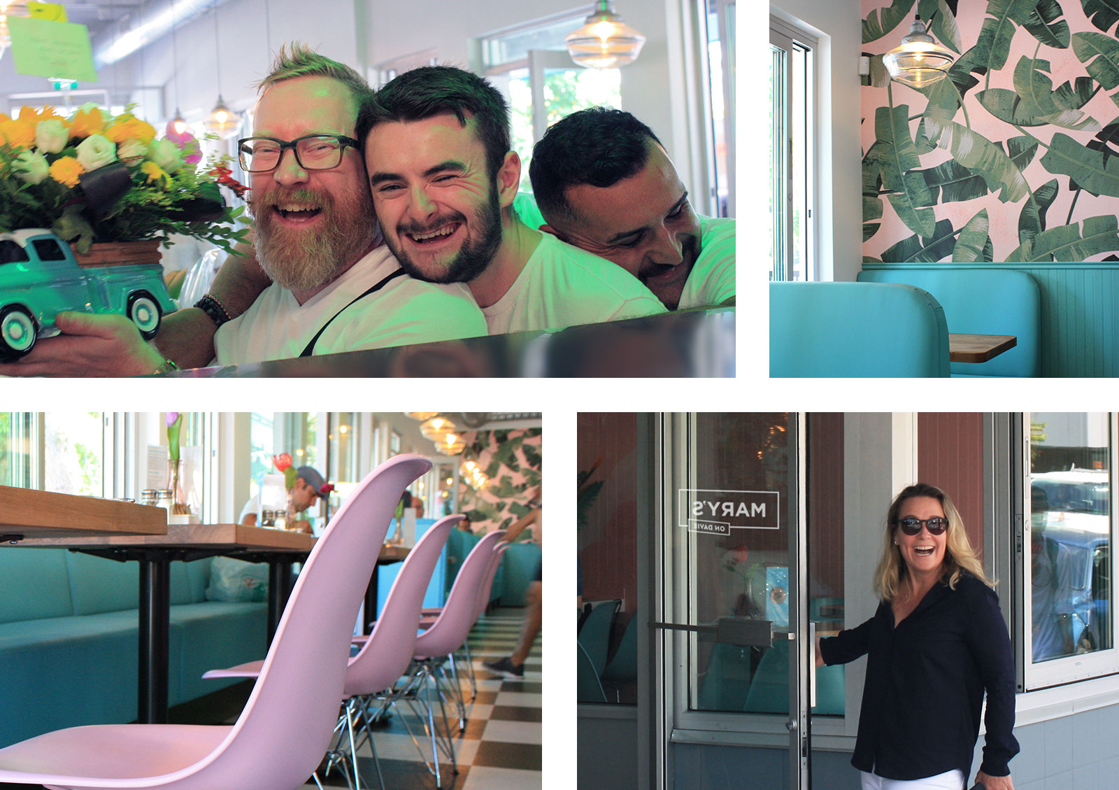
Mary’s on Davie
Reimagining the iconic ‘Hamburger Mary’s’ brand to appeal to Vancouver’s modern gaybourhood customers.
Brand direction
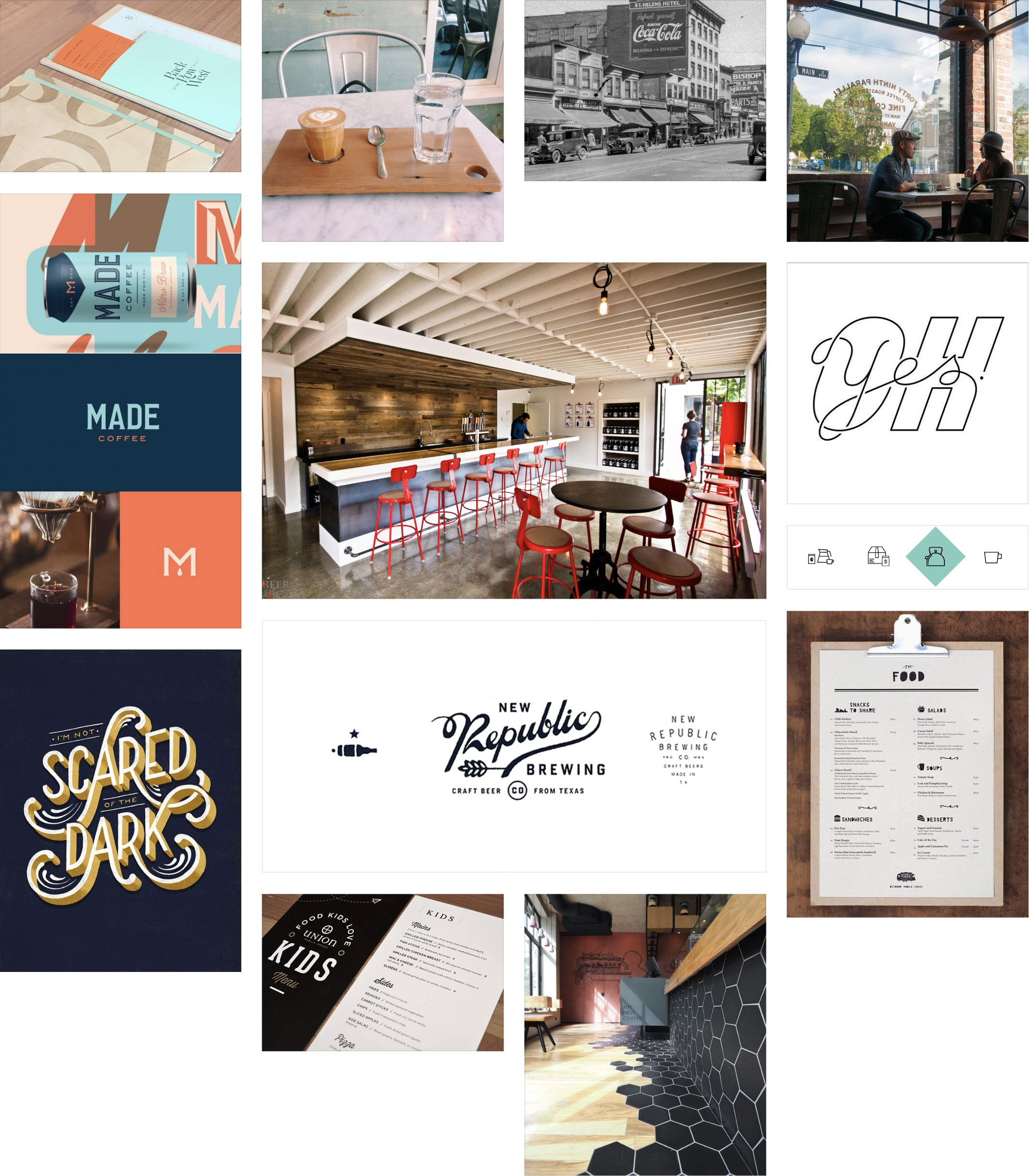
By presenting moldboards to the client we were able to quickly align on a direction for this exciting brand re-invention. I crafted two directions to present to the client:
1. Modern Classic
Minimal, modern yet classic look. Clean, simple – with broad appeal to the neighbourhood and city.
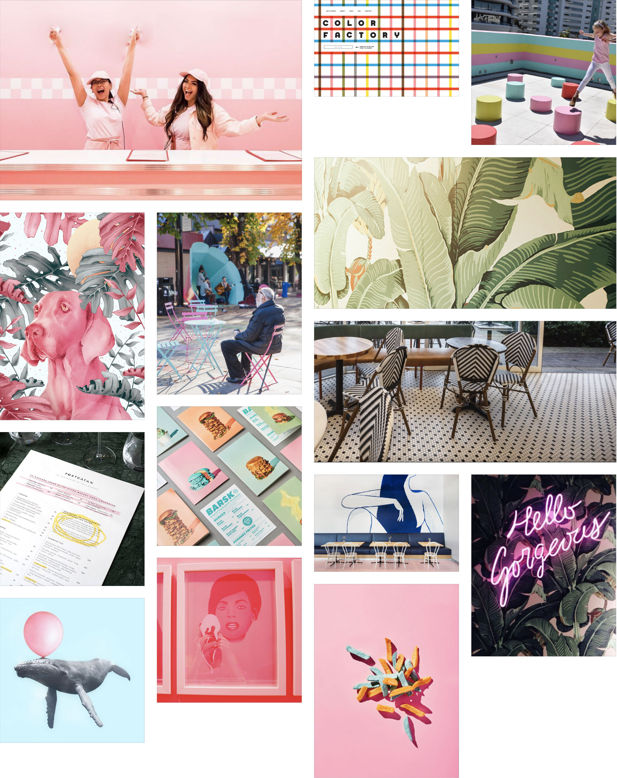
2. Fun, Colourful & Sassy
Reflecting the colourful and vibrant community that is the West End. Evoking a fun, unique and memorable space to hang out.
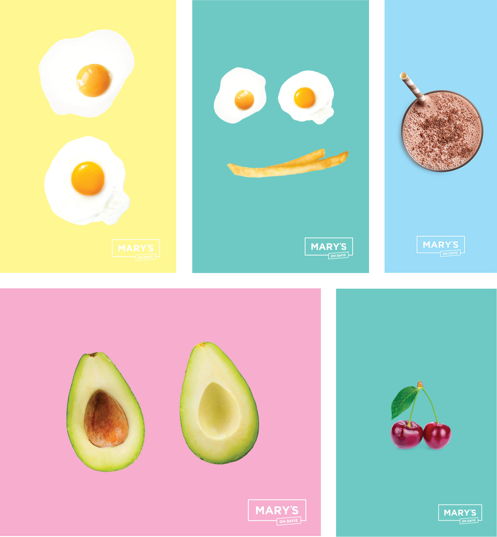
Branding Applications
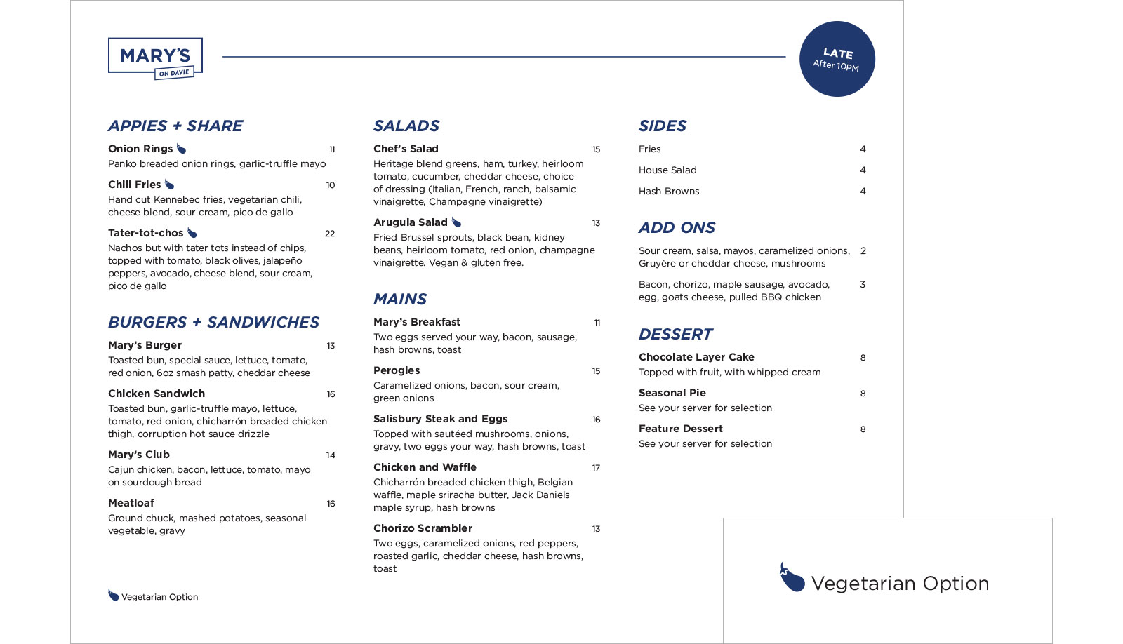
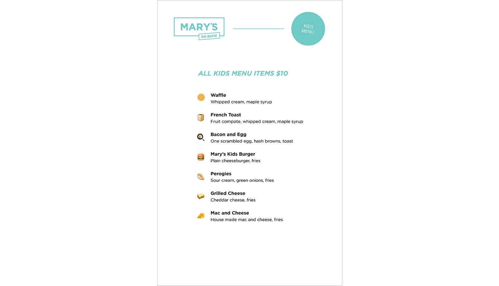
Menus
Social Media Response
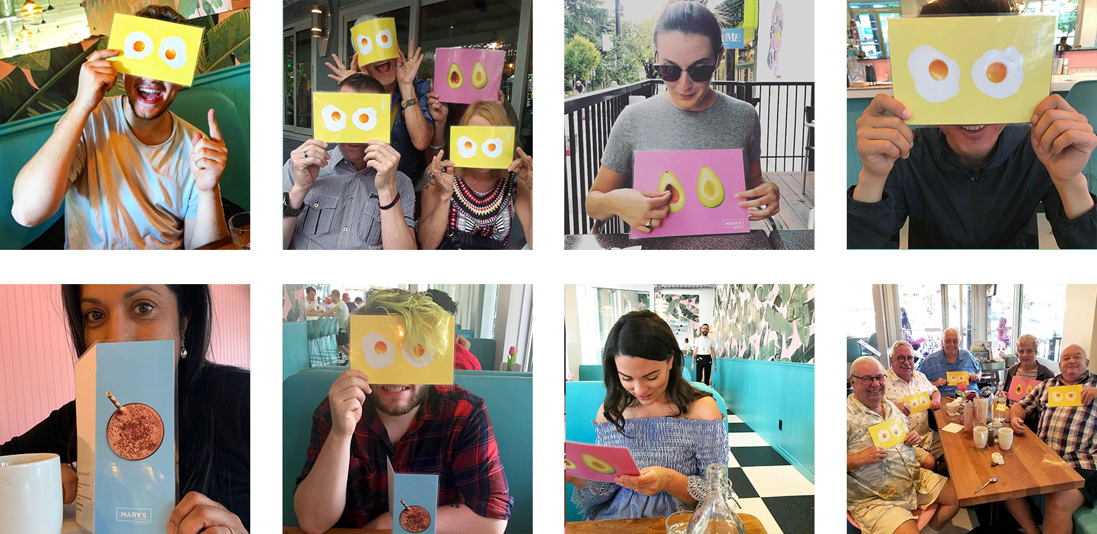
The branding and menus were extremely popular on social!
Photography
