Client Name
Buyatab
Industry
Technology, Software as a Service, Retail
Role
Art Director / Web UI Designer
Buyatab
Technology, Software as a Service, Retail
Art Director / Web UI Designer
Buyatab is a leading gift card platform for a wide range of sectors including retail, restaurants and hotels. They offer seamless, custom branded flexible and secure infrastructure, technology and marketing services across Canada, United States, Europe and Asia. World-class brands like Fairmont, Whole Foods, Air Canada, Saks Fifth Avenue and Cineplex use Buyatab for their gift card solutions.
Buyatab provides excellent customer experience at the consumer level, it was important that their website represented their business in the same way to the brand manager and distributor audience.

Buyatab’s web presence was not reflecting their industry-leading product and offering. The website overused insincere stock photography, and an overall amateur and dated feel to it.
Through a complete Brand Discovery process and meeting we touched on all areas of the visual branding. Their brand guidelines had set colours and typography, but was otherwise flexible. The client wanted a clean and modern “less is more” approach to the site.
The key messages the client wanted to express through the design:
They wanted to reduce the reliance on stock photography, but did not have any existing assets nor resources for custom photography.
The challenge for the design was present concepts that were friendly and human, but without any custom photography – as well as being unique to the brand and established and world-class.
For each concept I experimented with different approaches to include a human element. Both concepts featured the Buyatab gift card platform on screen.
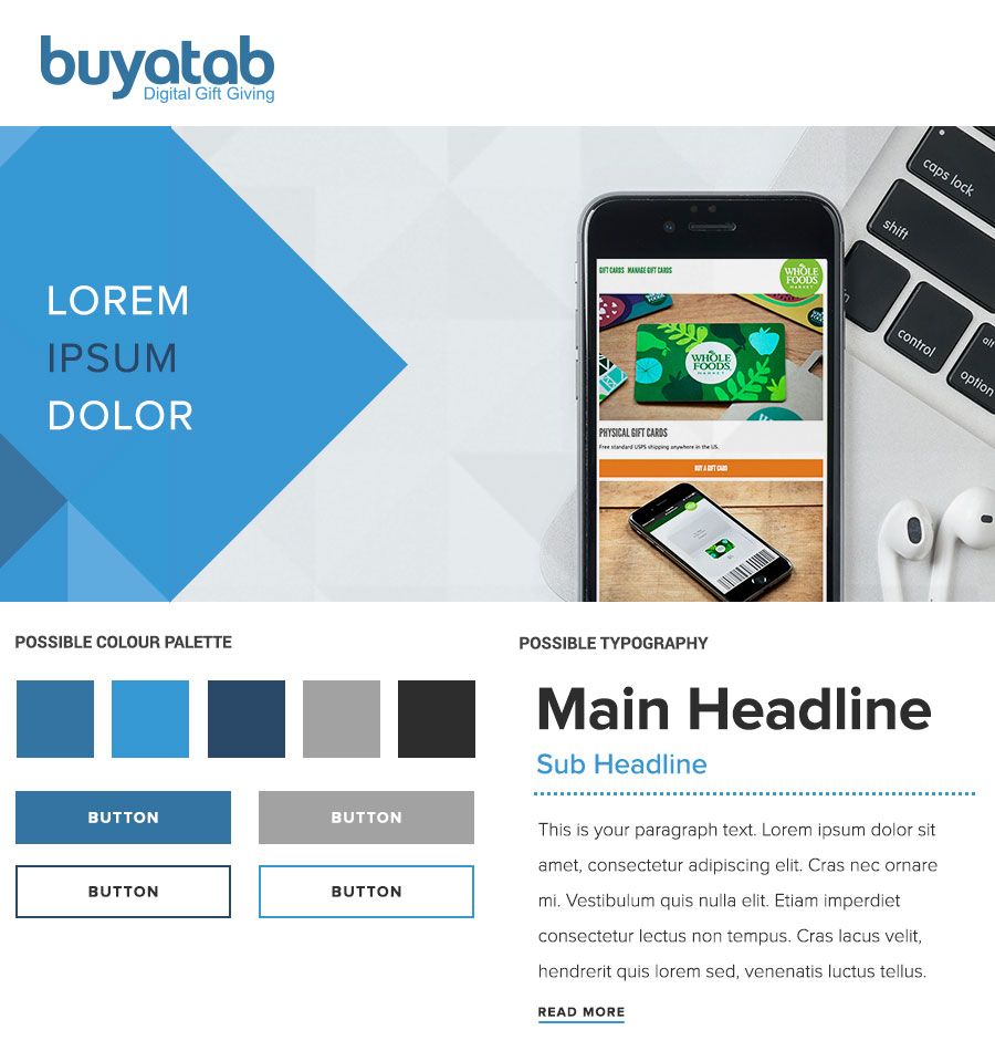
Minimal Modern Photography
Bold headings
Featuring the brand blues
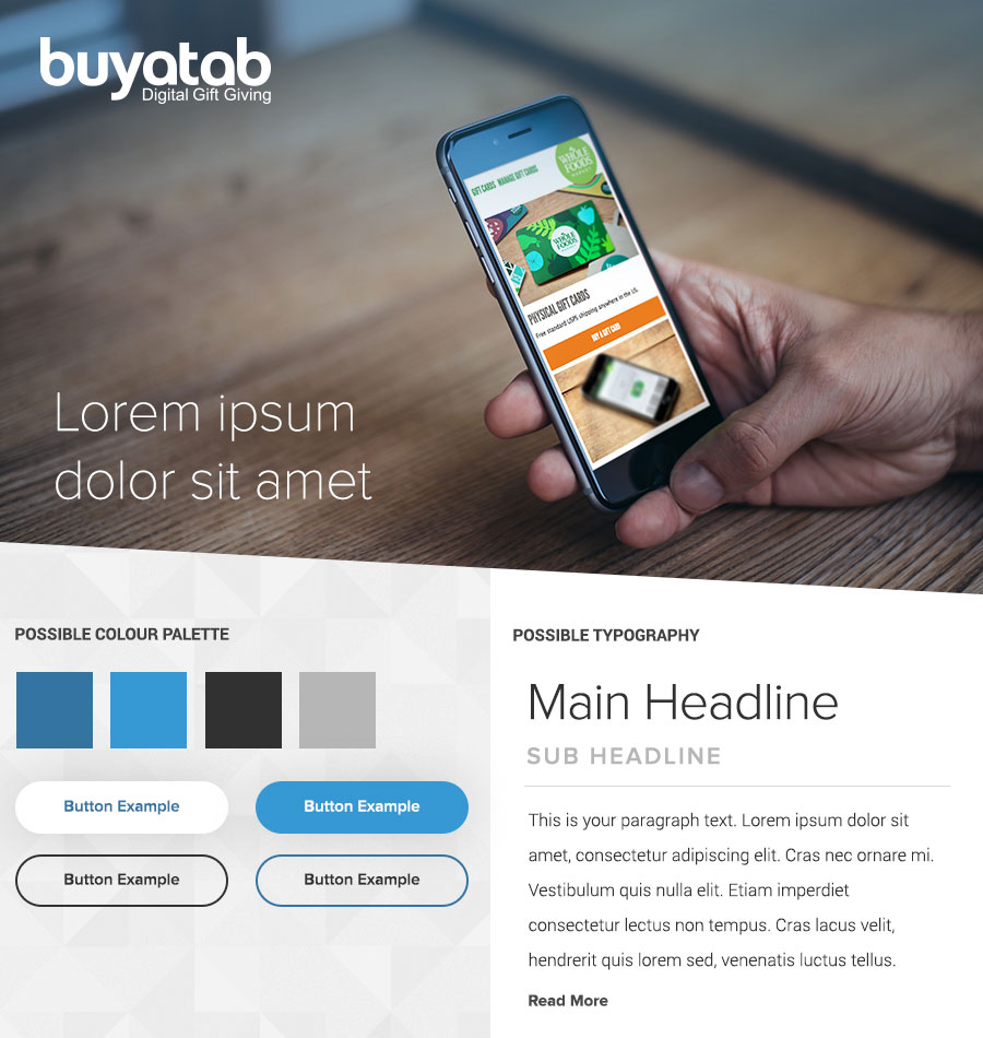
Situational Photography
Lighter headings
Minimal monochromatic colour application
In Concept A a human element was introduced in a literal way showing a hand interacting with a phone. In Concept B I brought in the human element in a more subtle way, using everyday items to make the visual relate to the real world.
Though the brand guidelines were tight, I presented two concepts that had different styles and feel, but still fit within the requirements. The brand colour and typeface were already defined; but for each concept I presented different treatments to the heading styles. This difference facilitated discussion on what would and wouldn’t work for the brand, what they liked and disliked and where I could take the brand.
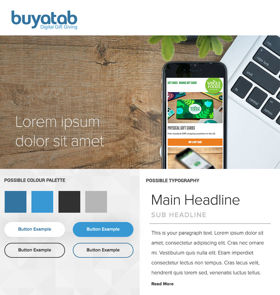
The client was engaged with and excited by the concepts presented. After discussion, elements from each concept were selected. The above hybrid tile was the tweaked and finalized to move forward.
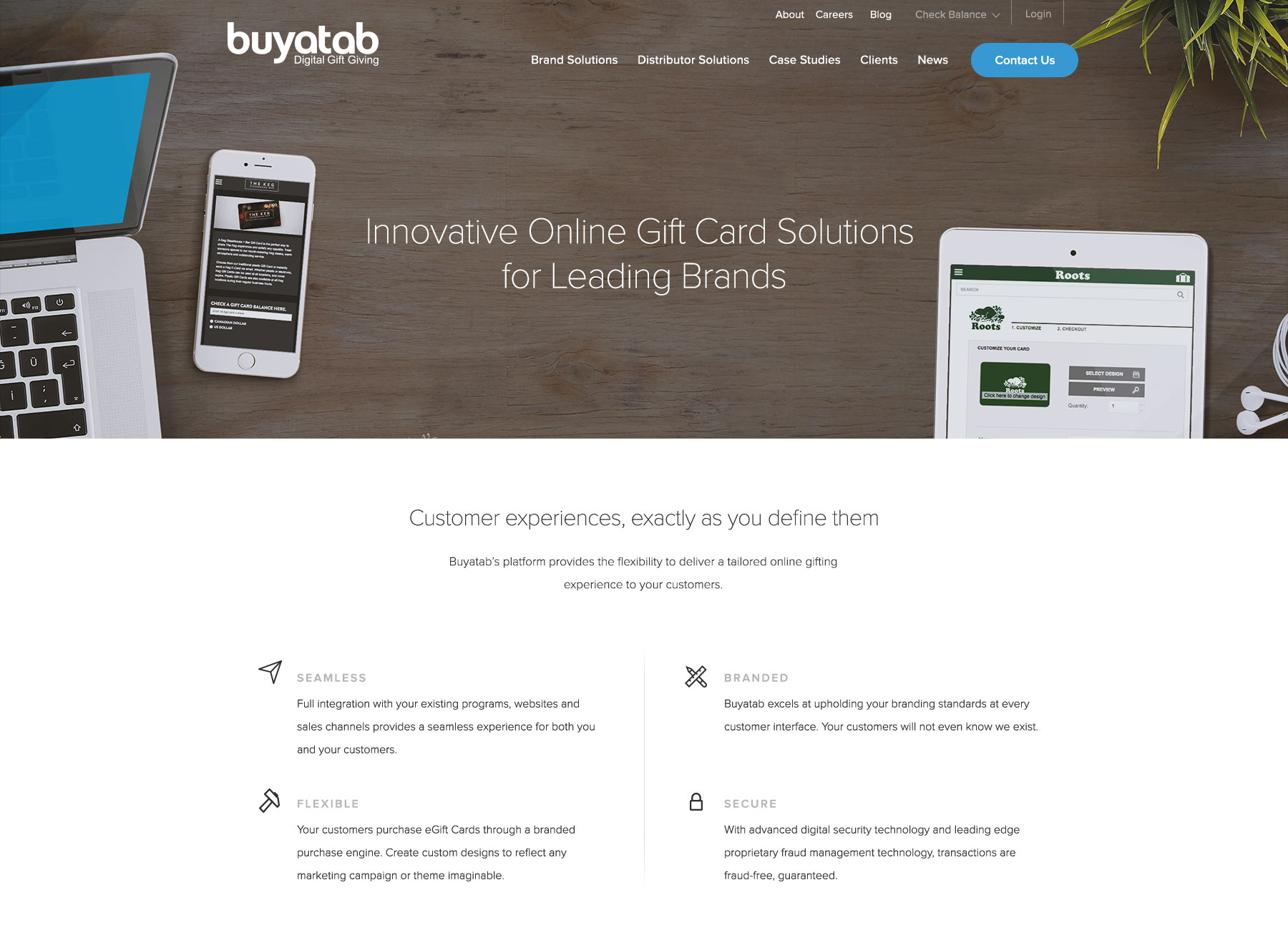
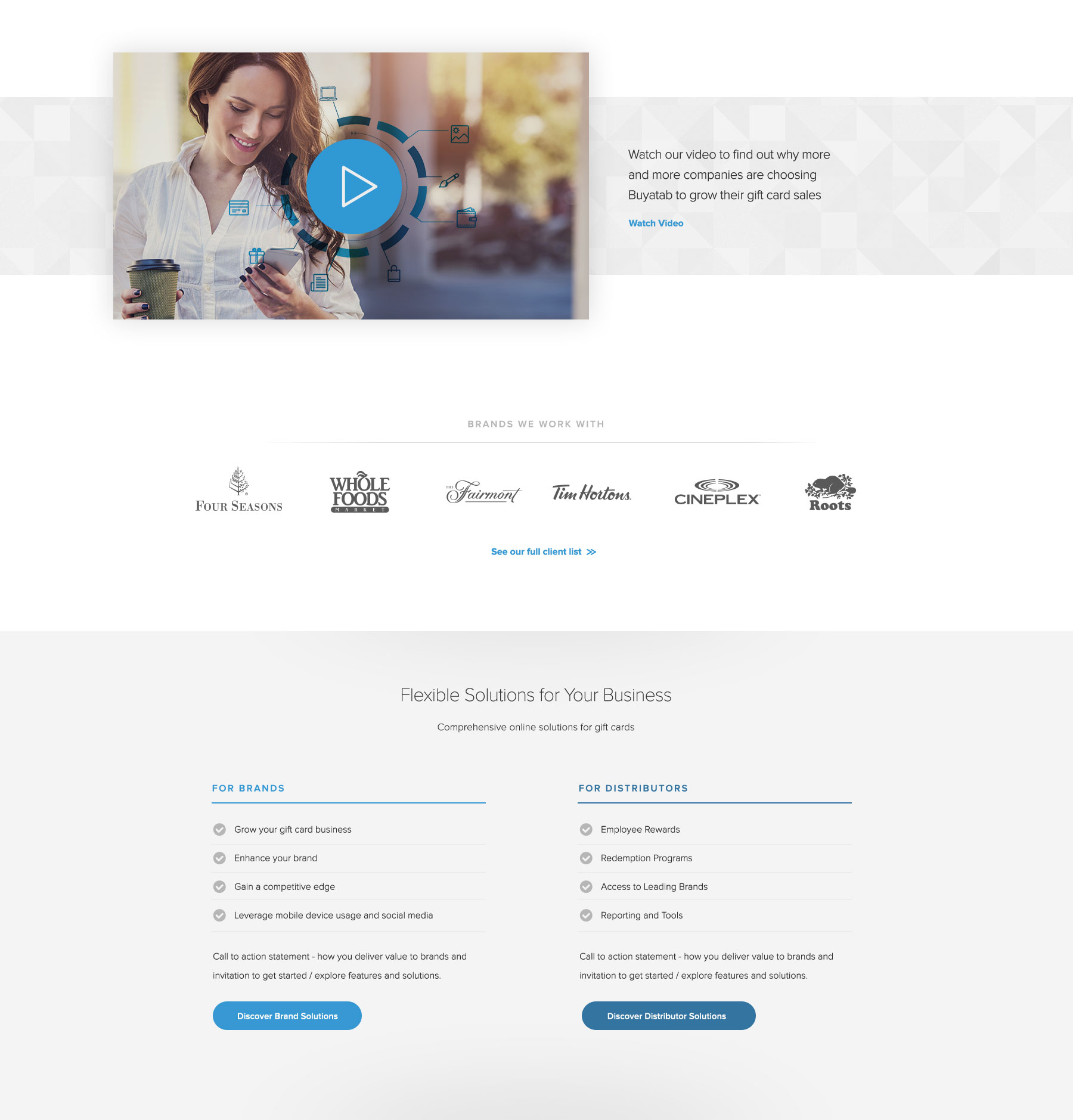
The hero imagery features the Buyatab platform for several clients. Simple small icons were introduced in as another visual element to enforce and add hierarchy to content. The feature video was incorporated with an engaging visual element. The site came together and delivered on a clean, modern, unique experience.
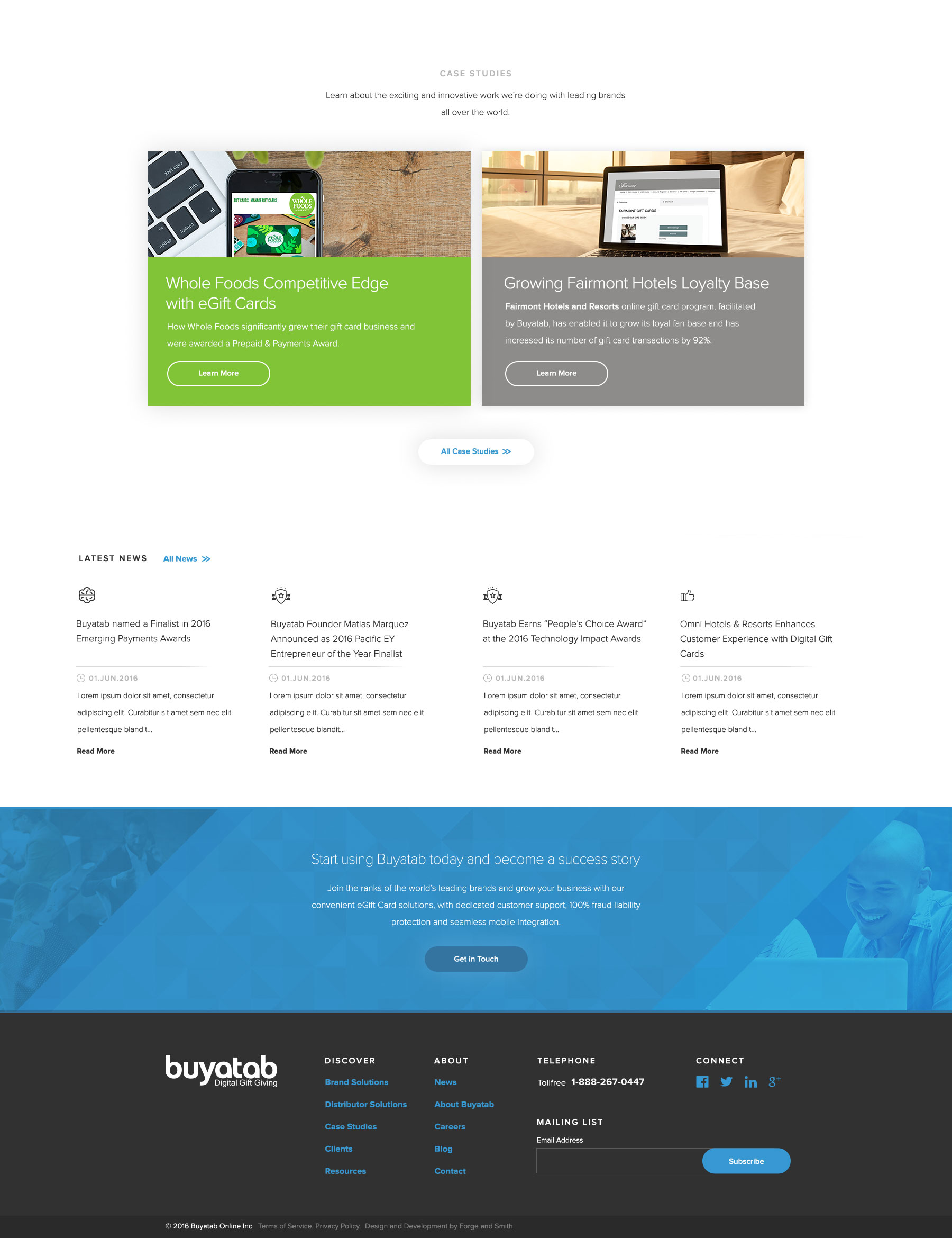
Explore the entire desktop homepage design below.
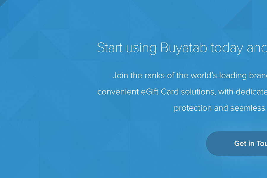
Buyatab’s old website had a mosaic-like texture used on certain elements – it felt dated and at times distracting. Instead of ignoring this component completely, a more subtle and evolved pattern was used, which also allowed for brand recognition for existing clients.
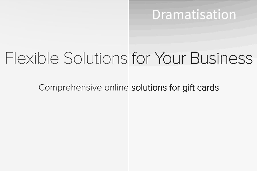
While the design was mostly minimal and flat, subtle shadows were applied to give the design further depth and help add to the hierarchy of elements in the design.
Explore some of the key page designs below.
The client wanted added interaction on this page. The about page utilized SVG icons that I custom designed.
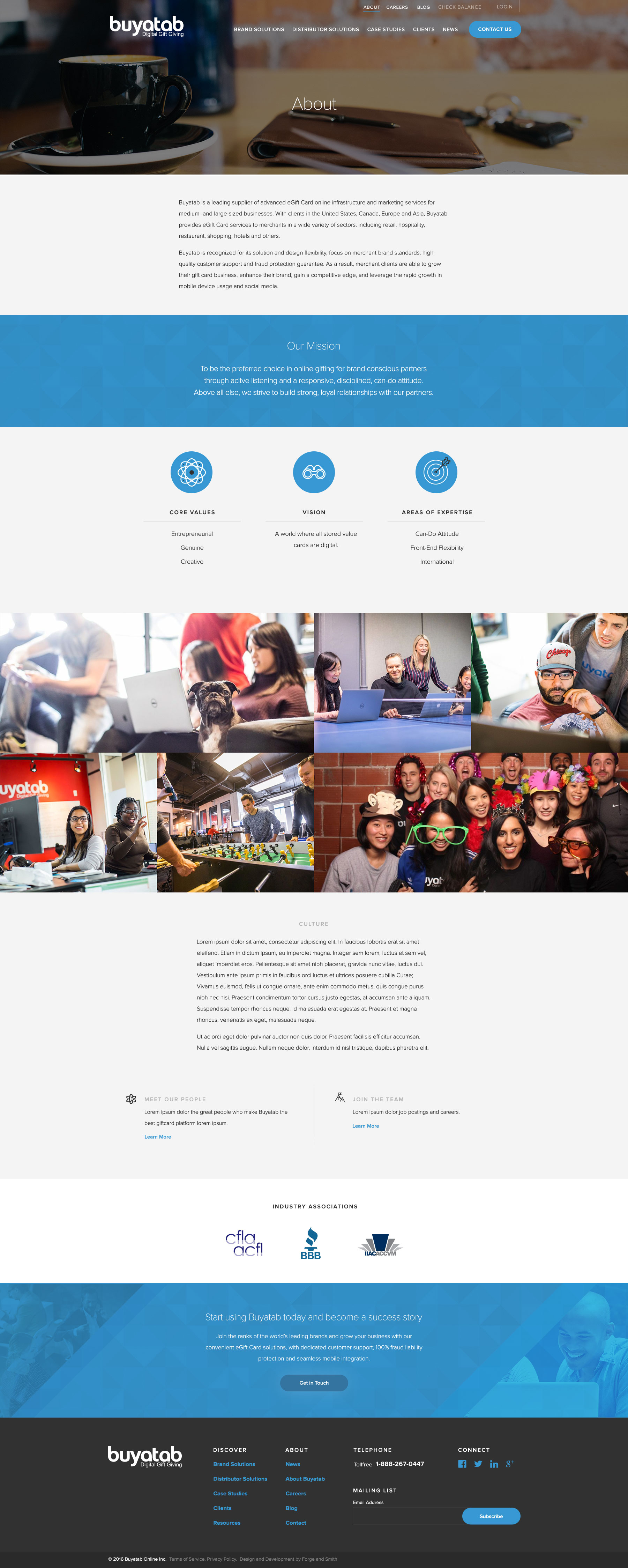
Through the case studies section, the situational visuals were created to match each the brand featured (for example the laptop on a hotel bed for Fairmont).
As the case study content was gated (requiring the user to submit their contact details to download the complete PDF), I wanted to make sure each one was engaging and enticing. A custom brand colour was used on each case study to match the featured brand, paired with the custom imagery it added a unique and subversive experience to each case study. This level of customization was reflective of the customization Buyatab offers their own clients through their platform and marketing materials.
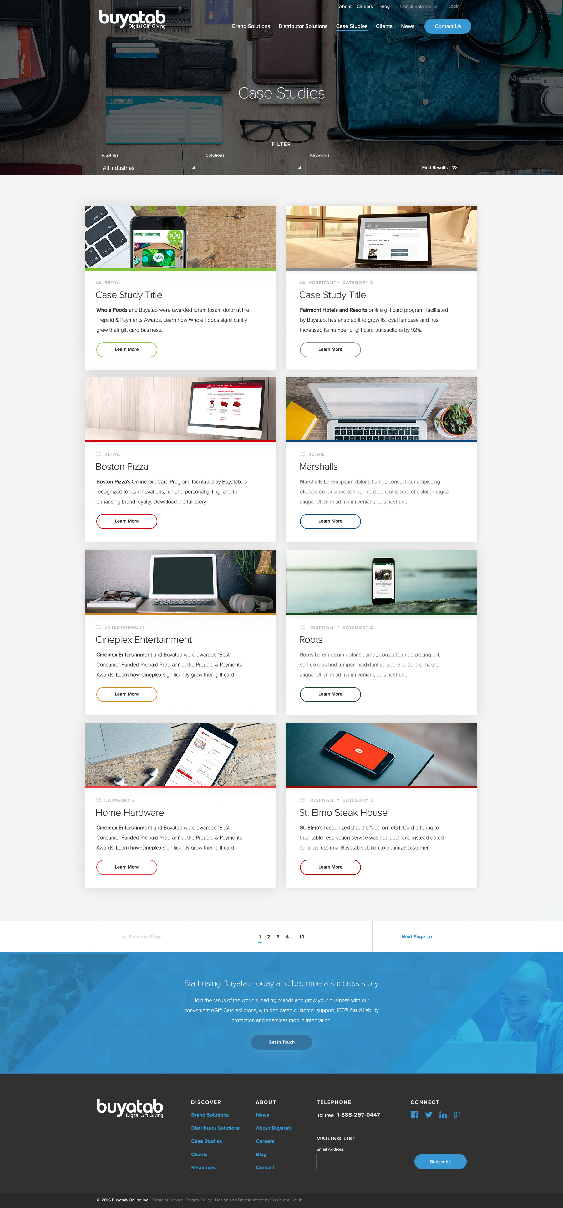
The case studies were identified as a key component in the user experience and customer journey. Even though the page itself is relatively simple, there was a lot of thought and attention to detail that went into the design.
The forms were designed with accessibility and ease-of-use in mind.
For the next and previous case study links at the bottom of each page, I suggested highlighting a benefit or result from that specific case study to entice the user to continue their experience within the site and add to their excitement for the brand.
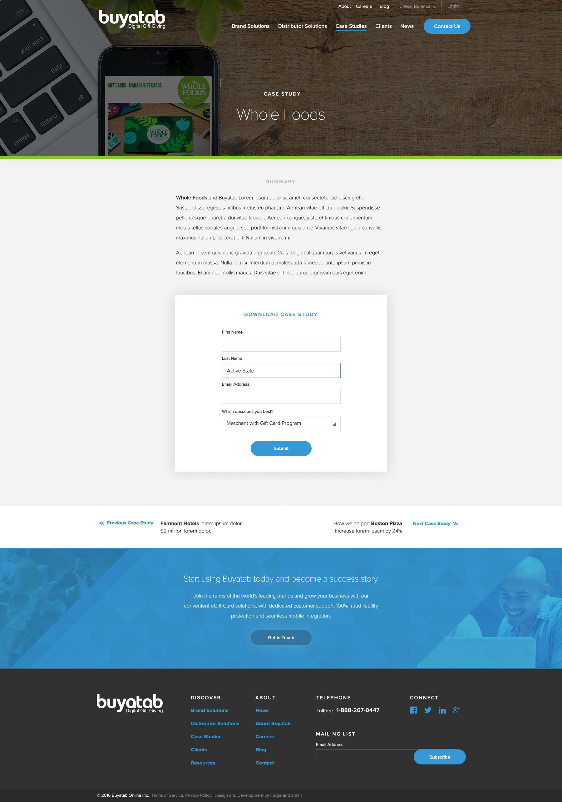
The completed Buyatab website had twelve unique page template designs.
Want to know more about the complete design process? Get in contact
A mobile-first thought approach was taken throughout the design process. Design mock-ups of responsive mobile pages were created, along with a mobile-friendly navigation menu.
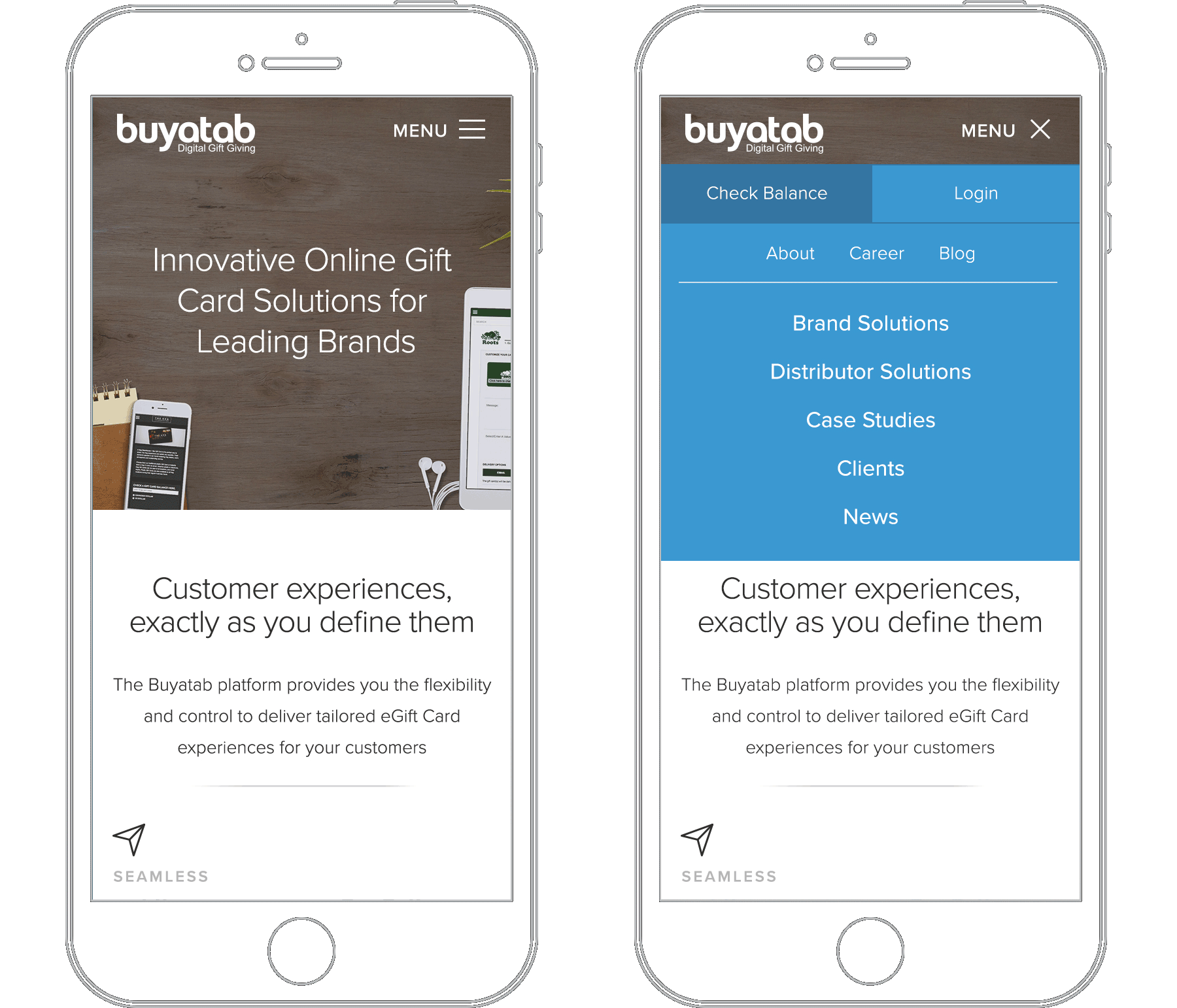
Design doesn’t end when design files are finalized and sent to a developer, the process continues on to site launch and beyond. This part is one of the most important pieces of the entire process – making sure everything works not just now, but into the future.
This includes ensuring items are responsive, clear and usable on mobile, that the built site will still work when there is more (or even less) content and that accessibility standards are exceeded.
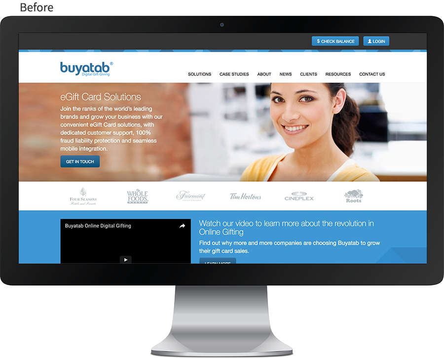
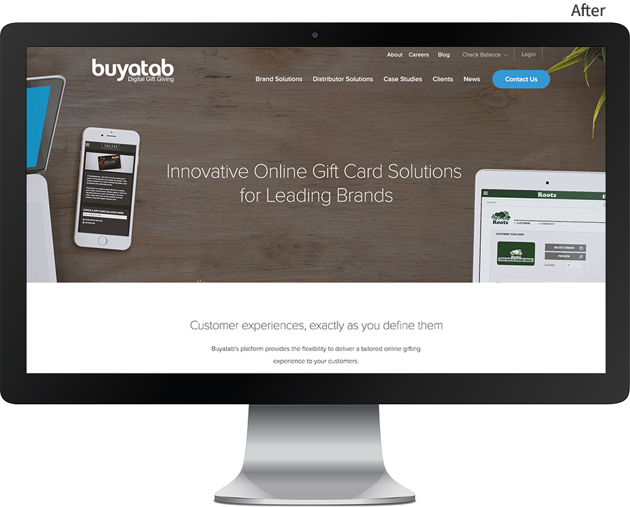
Working with the Buyatab team was a delight. I am so proud of what we achieved working together. The website elevated the brand website from insincere and amateur to modern and world class.
Check out the change by moving the slider above.