Designing a website is an exciting project! More than just designing a beautiful online experience, I often get to help small and medium-sized businesses define who they are and flesh out their visual branding.
The website has become a defining pillar of engagement and communication for a business. It is exciting and humbling for business owners to trust me with this – but it also puts a lot of pressure on the design. It can become a bloated, daunting or even stifled process – especially when there are many parties who want to give input and have involvement. It’s important to engage at the right times in the design process and in the right ways.
Options come early
If you can hone design directions early on it will save large amounts of time and frustration down the line. The sooner you can narrow it down, the better. This will also ensure that the eventual design will hit the right mark. You’ll please and amaze clients, and make the process easier on yourself. It also breaks the process into smaller bite-sized pieces for the client to think through and digest, without being overwhelmed. Focusing on the right details at the right time.
Introducing Style Tiles
Before starting any web page design mock-ups, I take the client through visual explorations with Style Tiles. This process presents clients with light design explorations and gives them small decisions on design direction.
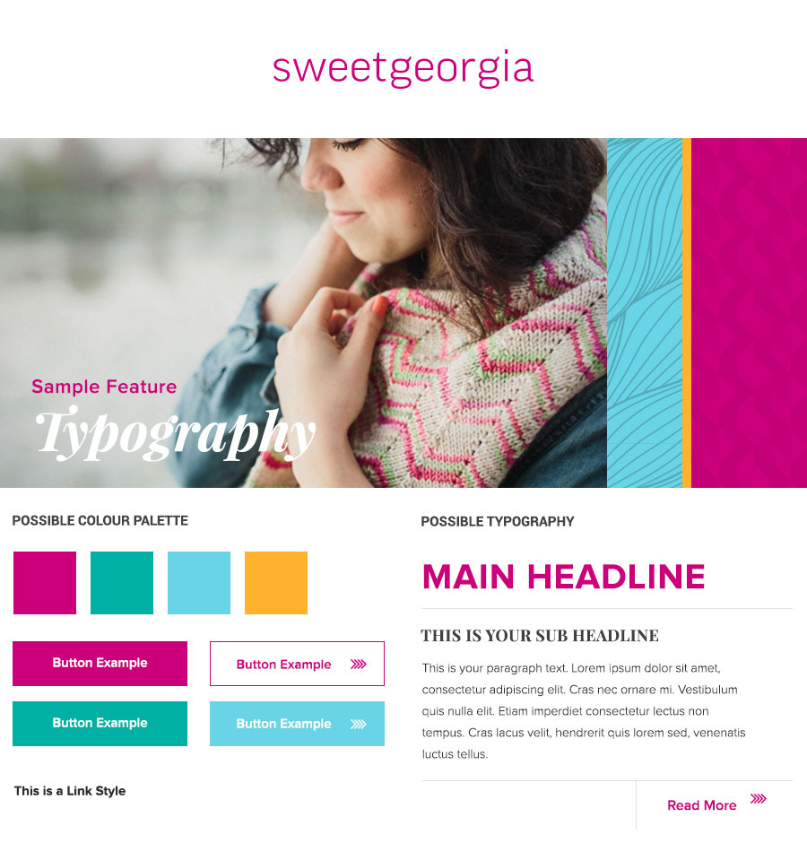
Style Tiles are a ‘mood board’ of sorts, specifically for websites. They provide a snapshot of colour application, typography stylings, buttons, photography options and treatments – and how those elements interact.
Before any project starts, the client and designer might discuss colours, typography, look and feel in kick-off and discovery meetings. A Style Tile is the continuation of that discussion, in a visual format. While they may be considered a deliverable, they don’t have to be strictly approved. Think of them as a visual discovery session, they focus the direction.
An example of Style Tiles I created for a website:
Style Tile A

Style Tile B

See how this Style Tile was applied in my SweetGeorgia case study
Even though both of these examples fit into the existing branding guidelines, you can see how they were an exploration of different directions of how the brand was applied.
Style Tiles should not sacrifice creativity for the sake of efficiency! A variety of directions can be quickly designed and shared with the client (or internal team). Because Style Tiles are just a glimpse of potential, it also allows the tone to be pivoted and tweaked quickly. Style Tiles create a focused space for you to design within.
Why Style Tiles?
Style Tiles have had a positive impact on my design and feedback process in many ways:
1. Show rather than tell
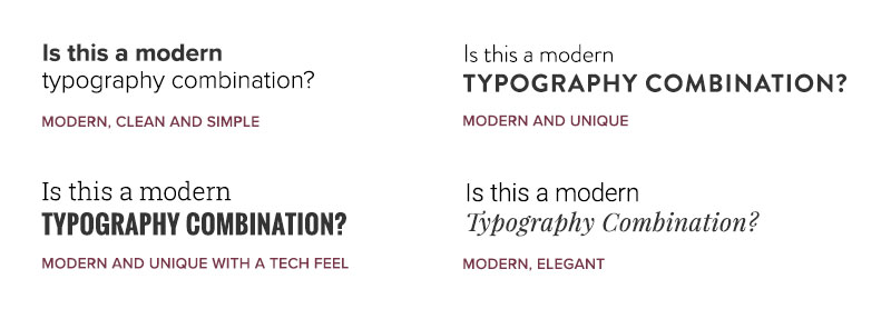
What does ‘modern’ mean to you, and what does it mean to your client? Does the client think it means all sans serif fonts, or tech-looking fonts, or a trendy-modern combination of sans serif and serif fonts? We could spend hours breaking apart what exactly ‘modern’ means through lengthy discussion or explore it visually.
Style Tiles do exactly that: they show rather than tell. Having a simple visual representation eliminates ambiguity. Using words makes sense for exploring copy; for exploring design, visuals make more sense.
2. Save time!
The most obvious benefit of Style Tiles is the massive time-saving capability. Style Tiles can be quickly put together, changed up, and torn apart.
Other approaches to the web design process include presenting several different complete and polished homepage mock-ups. A homepage as the first visual deliverable is extremely loaded – there are hundreds of design decisions that the client was not a part of, which can make taking in an entire page design frustrating. Additionally, each mock-up can take hours for a designer to perfect – with at least half of this work eventually being scrapped.
Many clients request several design options so that they have the opportunity to provide feedback and choose the elements that best suit them. Style tiles facilitate that without hours of wasted design time. Several tiles can be designed in a fraction of the time of one homepage design – if one of the approaches is not selected, the amount of time wasted is minimized with Style Tiles.
3. Establish credibility
Style Tiles allow you to quickly show that you listened to requirements and requests, while also showing the designer’s ability to be creative and evolve a brand. Friction points are reduced as tweaks and direction can be pivoted quickly.
4. Engagement not frustration
Style Tiles break the many decisions involved in designing a website down into small bite-size pieces and invite feedback. They allow a client to engage in the design process at an early stage.
One of the most important things I have learned as a designer is that clients want to be involved in the design process. They aren’t designers, or experts, which is why they have hired one – but they do want to work together and have their say. The more input and dialogue between client and designer, the better the relationship will be.
5. Insights and client relationship
Having this visual discovery and inviting feedback at an early stage helps the client and designer work better together. Getting insights into your client’s taste, vocabulary, and working style is quick and easy through these small design snippets. My most candid and useful insights into a client, their brand, and their personal taste come from Style Tile discussions.
We can start communicating in a common language and gain an understanding of each other. Style Tiles ensure everyone is on the same page before any major pieces of the design are created.
6. Style Tiles have your back
As well as all the benefits to your clients, Style Tiles will also help you as a designer. They are a flag in the ground illustrating an agreed direction. Should the project be derailed for any reason, you have a solid rationale behind the design decisions that were made.
How to work with Style Tiles
I have a template I like to use when designing Style Tiles. I can quickly and efficiently put together several looks for a site. Using the same tight constraints of the tile, I have still come up with fun ways to take the designs a little further. I like to take at least one tile further on each project, pushing the brand in an exciting new direction that they might not have considered, but might enjoy.
I generally present two or three unique directions as Style Tiles for each project and work with the client to refine those options down to one direction. Feedback and rounds of revisions are able to move quickly.

Some design elements may already be defined by brand guidelines – but when they are not, these are some things that can be explored through a Style Tile. What you include in a Stile Tile may differ per project and adapt this process to what works for you (and your client).
Logo
- Logo choice, such as horizontal or vertical format
- Colour logo or reversed/white on a background (colour or image)
- Placement
- Interaction with image(s)
Images
- Tone of images
- Subject matter of images (such as lifestyle or product shots)
- Macro photos vs. landscape shots
- Treatment and filters over images (darkened, lightened, blurred etc.)
Colour palette
- Colours that are set by the brand/logo
- What colours be used to accent design elements
- Colours that could supplement the design
- How the colours work together
- The tone of the palette: bold, pastels, colourful, complimentary etc.
Most brands have a predefined colour palette. There may not be any need to experiment with colour – but sometimes there is an opportunity to bring in a few complementary colours.
If a brand doesn’t have any set colour palette or branding, you can also pull the Style Tile back further to only include the logo and colour palette in the first round and develop it further from there.
Typography
- Combination of typefaces on the tile, or using the same for all headlines and body text
- Combinations of typefaces (thin, thick, bold, fancy) and how they work together
- Using ALL CAPS vs. sentence case for headlines
- Application of colour on the typography
The tile is purposely detached from real text content, which allows the viewer to focus on the design specifics without the distractions of copy or layout.
Label headings (ie. ‘main headline’ as shown in the example) to aid communication and the same ‘lorem ipsum’ placeholder text for body paragraphs so that they can be directly compared.
Buttons
- Bold and colourful buttons
- Monotone buttons
- Larger, smaller
- Square, rounded, three-dimensional or other button effects and styles
This is a short list of examples, I encourage exploration and play– take a Style Tile as far as you can within the constraints.
When presenting the tiles, you can highlight the specific differences between each tile you are wanting their reaction to.
Feedback
Arguably the most important part of the Style Tile process is the discussions and feedback on the tiles. I find it important to also ask and understand the ‘why?’ behind a decision; why a client chose a certain option or combination of options. These insights will guide you throughout the project’s design when making other design decisions.
Examples of great feedback
- The overall feeling of X was preferred over Y
- Buttons from X as they feel more modern
- Colour palette from Y will work with our slide presentations
- Don’t like how bold X is
Examples of poor feedback
- Option X
- Tile X with the buttons from Y
This feedback lacks context behind why these elements are preferred (or not) for the brand.
Encourage clients to provide feedback in a way that works for them – have fun and ask questions. An engaged client will be a great client to work with. Once they see that their input will really shape the design, interest, and engagement in the process will increase (as well as their enjoyment). I’ve witnessed it time and time again.
It is your responsibility to get the feedback you need. Share this article with your client, share resources and examples, walk them through how the tiles shape their website to ensure you do.
This is just the start of a web design process – but by setting up a solid initial direction, you will get have a much smoother process.
Additional resources
It’s pretty clear that I love Style Tiles. They’re a great tool to make the web design process more focused and efficient. Below are more Style Tile resources you might find useful:
Start with a Cupcake
This is a great metaphor for getting feedback early. I highly recommend you read the full article.
“The quicker you can get feedback on what you’re thinking the better your idea will be. Usage is oxygen for ideas… Two ways to plan out baking a wedding cake. You can deliver the base first, then the filling, and finally the icing. Only at the end of the final phase do you have something edible; something you can learn from. Alternatively you could start off with a cupcake. You’ll learn the flavours you like, uncover any problems in your kitchen, and in general you’ll fast forward the feedback loop.”
– Des Traynor, Co-Founder & Chief Strategy Officer, Intercom
StyleTil.es
Has their own downloadable template, information on style tiles – and this great diagram:

Case Studies
Check out how I’ve applied style tiles in my case studies.
I hope you gained an understanding of style tiles and area ready to apply them to your web design process – or even applying this concept to other areas of your work. If you have any questions, please reach out and ask.
Presentation
I have made this topic into a presentation – complete with slides. Share the learning!


